カテゴリー: iida

  • INFOBAR xv

    INFOBAR xv

    ANNOUNCEMENT DATE2018.07.12
    RELEASE DATE2018.11.29
    Brandau Design project
    TypeProduction Model
    DesignerNaoto Fukasawa
    ProducerSatoshi Sunahara
    ManufacturerKYOCERA
    Size ( W x H x D ) / Weight48 × 138 × 14 mm / 114g
    MaterialsPlastic, electronic components

    COLOR VARIATIONS

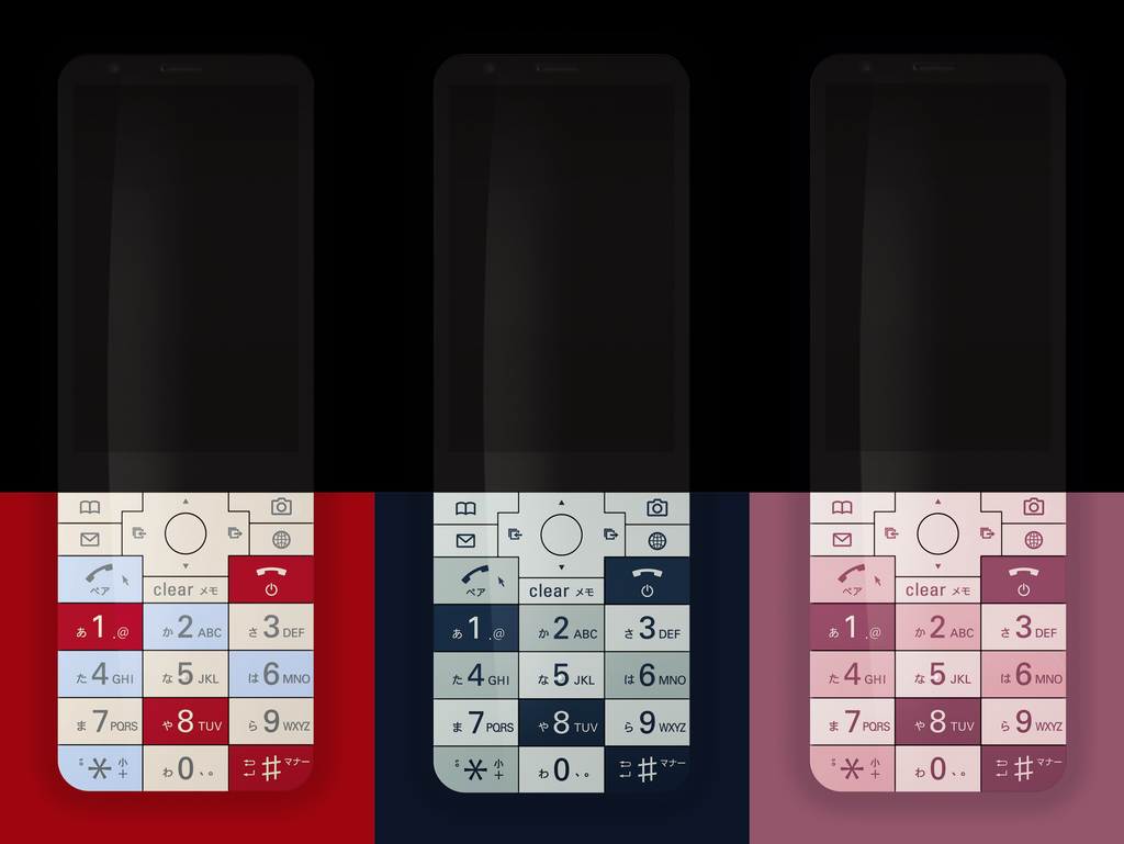
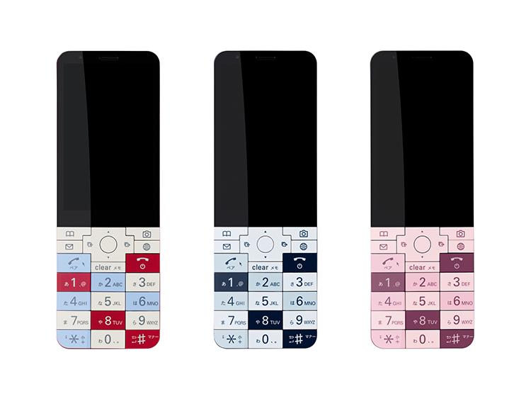
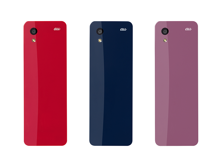
    NISHIKIGOI / NASUKON / CHERRY BERRY


    AWARDS

    • 2018年度グッドデザイン賞 / Good Design Award 2018

    ABOUT

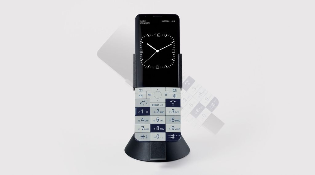
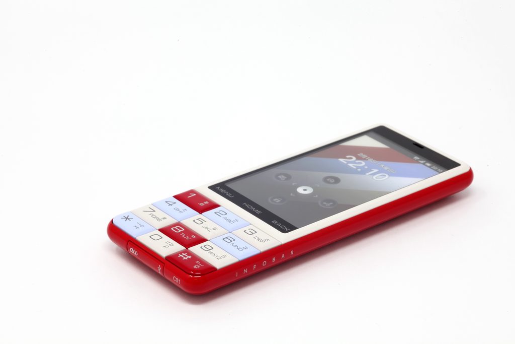
    15年目のINFOBAR

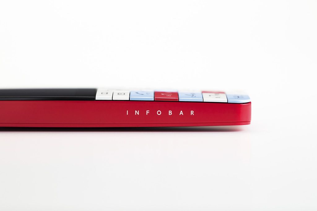
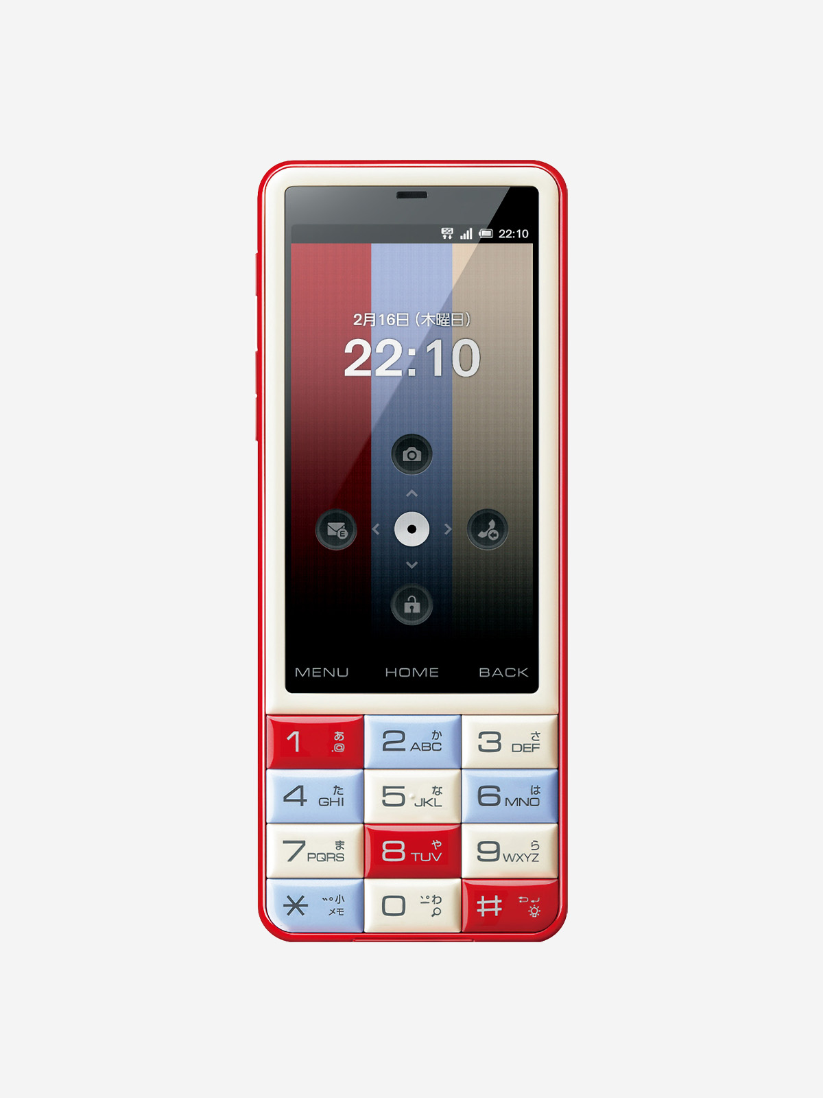
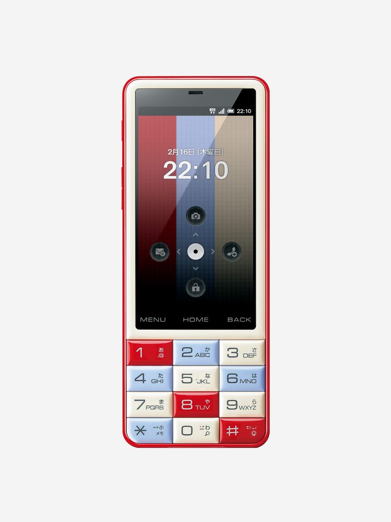
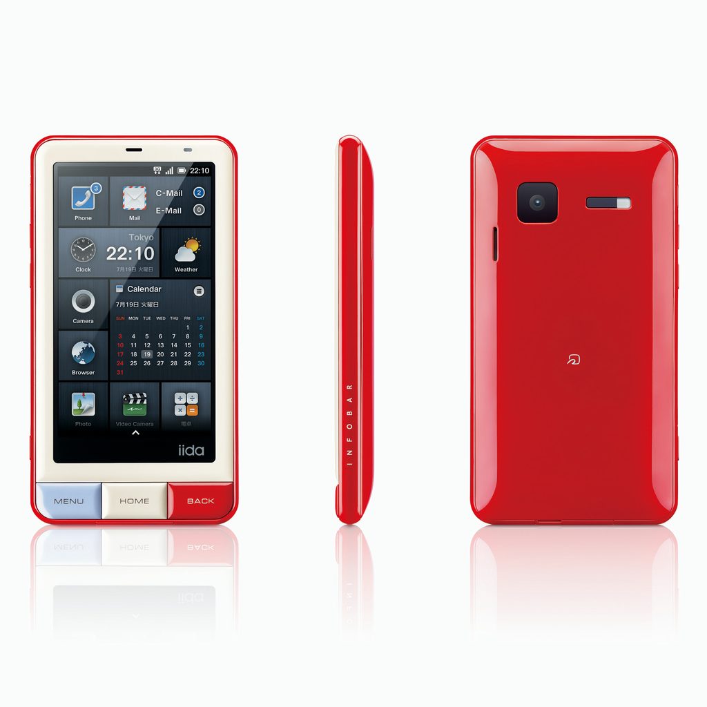
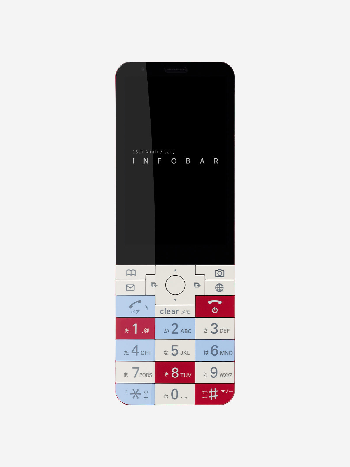
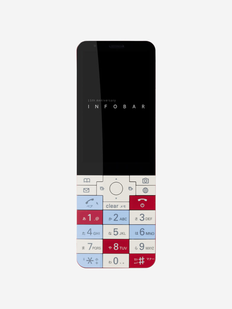
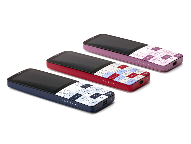
    2003年の初代INFOBAR発売から15年。その節目に、スマートフォンではなく、あえて「新・ケータイ」として誕生したのがINFOBAR xvです。デザインは歴代INFOBARと同じく深澤直人さん。初代INFOBARの端正なストレート形状とINFOBAR 2の柔らかな曲面、その両方の面影を受け継ぎながら、曲面と平面を組み合わせた新しい造形へと昇華されています。なかでも象徴的なのが、INFOBARのアイデンティティであるタイルキー。歴代モデルで目指しながら実現できなかった、キーとキーの間にフレームのない「フレームレスタイルキー」を初めて実現しました。視覚的な美しさだけでなく、手にしたときの心地よさを追求した「手が好きなかたち」です。

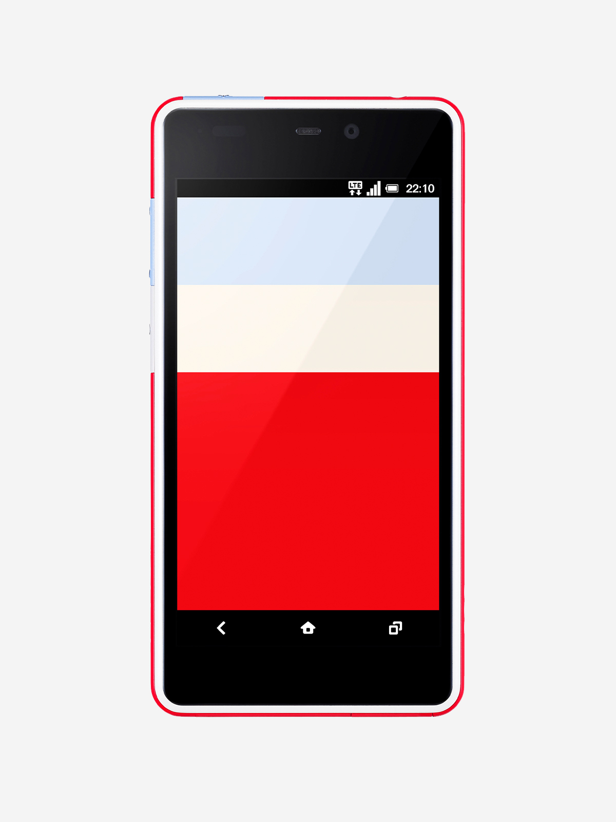
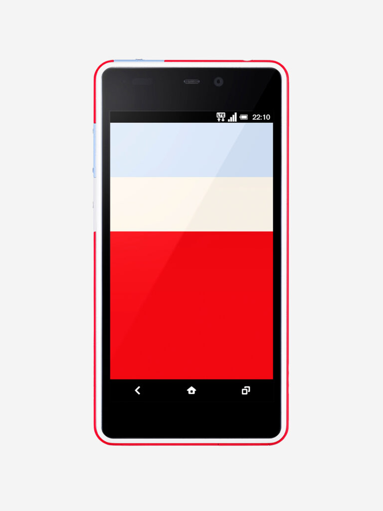
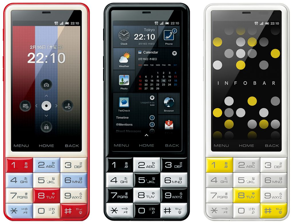
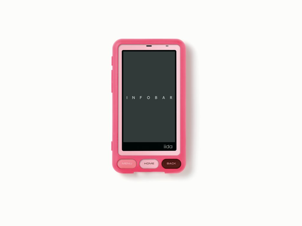
    カラーも15年の時間を映しています。象徴色「NISHIKIGOI」はトリコロールの魅力を残しながら落ち着いたトーンへ。深い紺色の「NASUKON」、グレイッシュな赤紫と桜色を組み合わせた「CHERRY BERRY」とともに、大人になったINFOBARを表現しています。

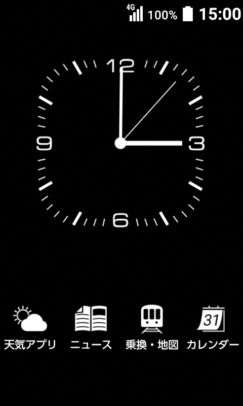
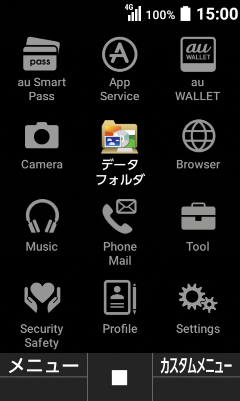
    高さは初代INFOBAR、INFOBAR 2と同じ138mm。そのサイズ感を保ちながら、3.1インチWVGAディスプレイ、約800万画素カメラ、4G LTE、VoLTEなど15年間の技術進化を収めました。 INFOBAR xvは、過去のデザインを復刻したのではなく、15年という時間を経てINFOBARらしさをもう一度デザインし直した携帯電話です。

    INFOBAR at Fifteen

    Fifteen years after the original INFOBAR made its debut in 2003, INFOBAR xv was created to mark its anniversary—not as a smartphone, but deliberately as a new kind of mobile phone. Like every INFOBAR before it, it was designed by Naoto Fukasawa. 

    Its form carries echoes of both the clean, straight profile of the original INFOBAR and the soft curves of INFOBAR 2, while evolving them into a new composition of beautifully balanced flat and curved surfaces. Most symbolic of all are the tile keys that define the identity of INFOBAR. For the first time, INFOBAR xv realized the frameless tile keys that had been envisioned for previous models but had never been technically achieved. The result is not only visually beautiful but also pleasing to the touch—a form designed around what feels right in the hand. 

    The colors, too, reflect the passage of fifteen years. The iconic NISHIKIGOI retains its distinctive tricolor composition in a more subdued palette, while the deep navy NASUKON and the sophisticated combination of grayish red-purple and cherry-blossom pink in CHERRY BERRY express a more mature INFOBAR. 

    At 138 mm, INFOBAR xv is exactly the same height as the original INFOBAR and INFOBAR 2. Within that familiar scale, however, it incorporates fifteen years of technological evolution, including a 3.1-inch WVGA display, approximately 8-megapixel camera, 4G LTE, and VoLTE. 

    INFOBAR xv was not simply a revival of a design from the past. It was a reimagining of what it meant to be INFOBAR after fifteen years.
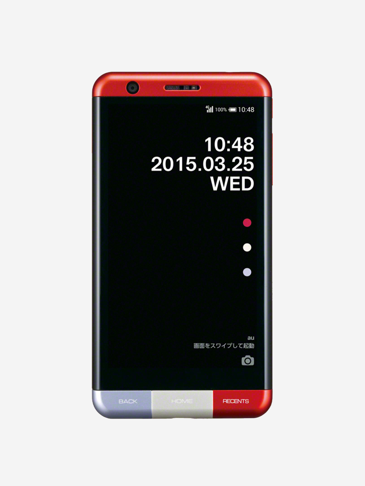
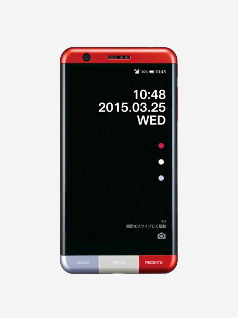
  • INFOBAR A03

    INFOBAR A03

    ANNOUNCEMENT DATE2015.01.19
    RELEASE DATE2015.02.20
    Brandiida
    TypeProduction Model
    DesignerProduct: Naoto Fukasawa
    UI: Yugo Nakamura
    Sound: Keigo Oyamada
    ProducerSatoshi Sunahara
    ManufacturerKYOCERA
    Size ( W x H x D ) / Weight68 × 131 × 8.9 mm / 130g
    MaterialsAluminum, plastic, tempered glass, electronic components

    COLOR VARIATIONS

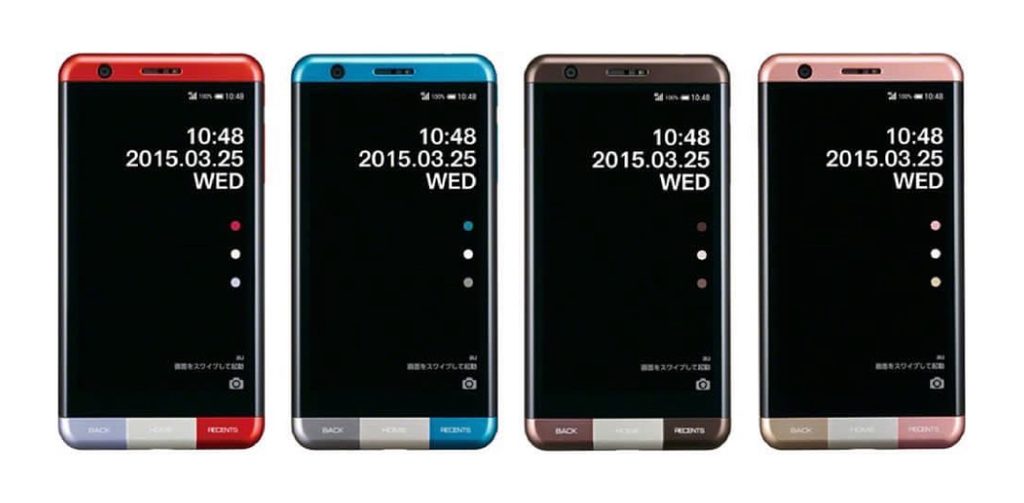
    NISHIKIGOI / POOL / MOCHA BROWN / SAKURA IRO


    AWARDS

    • 2015年度グッドデザイン賞 / Good Design Award 2015
    • iF DESIGN AWARD 2016

    ABOUT

    再びファッションへ

    INFOBAR A02は「シェア」時代に相応しいプロダクト & UIデザインの姿を具現化した一つの頂点だったと思います。その一方でファンの期待するINFOBARらしさを少し失いかけていました。そこで、前面にボタンを復活させ「モノとしての魅力」を追求するべく企画されたのが A03です。これまでの樹脂基調の筐体からアルミ基調の筐体に変更し、置き時計として使える卓上ホルダを同梱しました。さらにファッションやライフスタイルをテーマとした試みとして、伊勢丹新宿店との共同イベントを実施。マルニ木工製のウッドスタンドとミナ ペルホネンのブックタイプケースをセットにした限定スペシャルパッケージの販売や、ユーザーがスマホで撮影した画像を、クリエーター集団ライゾマティクスが開発したアプリでINFOBARパターンに変換し、ファッションブランドANREALAGE(アンリアレイジ)のセーターやTシャツに仕上げるという実験的な試みも行い、ファッションとしての価値を大切にするINFOBARの原点へと立ち戻ったモデルでした。

    Back to Fashion

    INFOBAR A02 represented, in my view, one of the high points of product and UI design for the age of “sharing.” At the same time, however, it had begun to move slightly away from the distinctive INFOBAR character that fans had come to expect.

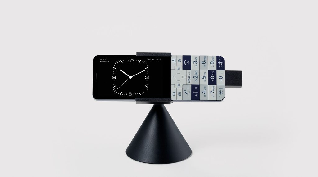
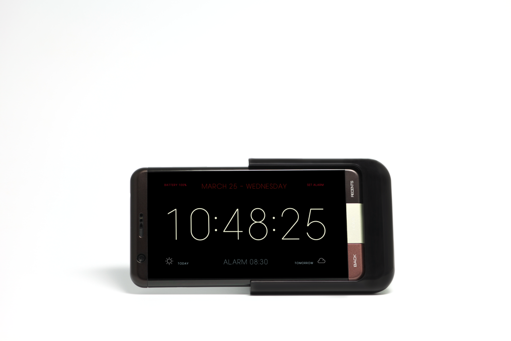
    A03 was conceived as a return to the appeal of INFOBAR as a physical object. Physical buttons were brought back to the front, while the body shifted from the predominantly plastic construction of earlier models to an aluminum-based design. It also came with a desktop stand that allowed the phone to be used as a clock.

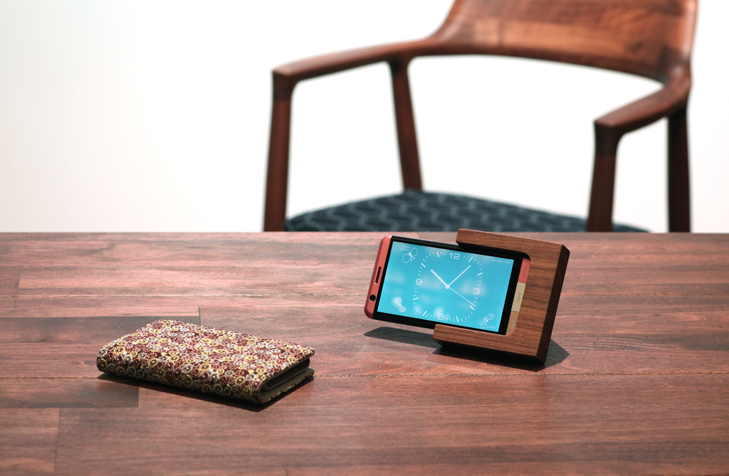
    A03 also explored new connections with fashion and lifestyle. A collaborative event was held with the Isetan Shinjuku store, featuring a limited-edition special package that paired a wooden stand made by Maruni Wood Industry with a book-style case by minä perhonen.

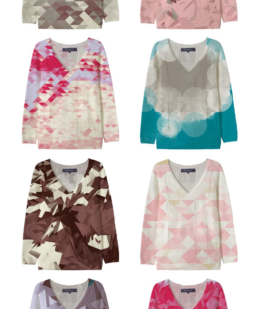
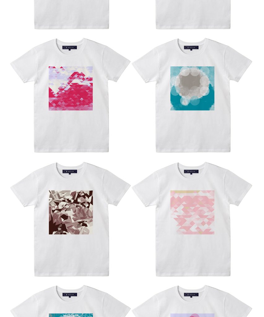
    Another experimental project invited users to transform photos taken on their smartphones into INFOBAR patterns using an app developed by the creative collective Rhizomatiks. These patterns were then turned into sweaters and T-shirts by the fashion brand ANREALAGE.

    Through these initiatives, A03 marked a return to INFOBAR’s roots—embracing once again the idea that a mobile phone could have value not only as technology, but also as fashion.


    卓上ホルダ&デジタル時計 / Desktop holder and digital clock

    au×ISETAN INFOBAR Special Package:マルニ木工製ウッドスタンド、「ミナ ペルホネン」ブックタイプケース& アナログ時計 / Wood Stand by Maruni Wood Industry, “minä perhonen” Book-Style Case & Analog Clock Photography by Satoshi Sunahara

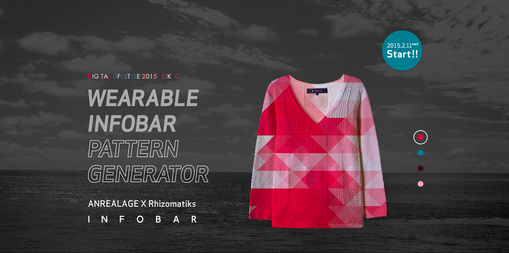
    WEARABLE INFOBAR PATTERN GENERATOR ANREALAGE × Rhizomatiks

    Design: Kunihiko Morinaga(Anrealage)× Daito Manabe(Rhizomatiks)

    スマホで撮影した写真を、メディアアーティスト真鍋大度さん率いるRhizomatiksが開発したアプリでINFOBARカラーのモザイクデザインに変換。それを実験的な服づくりで世界から注目を集めているデザイナー森永邦彦さんが手掛けるブランド「ANREALAGE」のセーター、Tシャツに仕立て販売。

    Photos taken with a smartphone were transformed into INFOBAR-colored mosaic designs using an app developed by Rhizomatiks, led by media artist Daito Manabe. The resulting designs were then made into sweaters and T-shirts and sold by ANREALAGE, the fashion brand founded by designer Kunihiko Morinaga, who has gained international recognition for his experimental approach to clothing design.


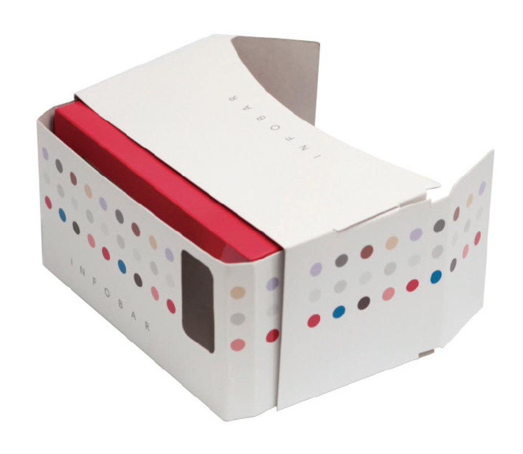
    ハコスコINFOBAR / HACOSCO INFOBAR
    Design: Naotaka Fujii + Keiko Otara

    INFOBAR 柄のダンボール製VRビューワー「ハコスコ」で、伊勢丹新宿店の店内を突き抜け、新宿の空にジャンプするVR 体験。

    An INFOBAR-patterned cardboard VR viewer, “Hacosco,” offering a VR experience in which users burst through the interior of the Isetan Shinjuku Store and leap into the sky above Shinjuku.

  • INFOBAR A02

    INFOBAR A02

    ANNOUNCEMENT DATE2013.01.25
    RELEASE DATE2013.02.15 NISHIKIGOI, ICE GRAY(Early release in the Kanto and Okinawa with other regions to follow) / 03.15 AOAO
    Brandiida
    TypeProduction Model
    DesignerProduct: Naoto Fukasawa
    UI: Yugo Nakamura
    Sound: Keigo Oyamada
    ProducerSatoshi Sunahara
    ManufacturerHTC
    Size ( W x H x D ) / Weight70 × 138 × 9.7 mm / 147g
    MaterialsAluminum frame, tempered glass display, plastic, electronic components

    COLOR VARIATIONS

    NISHIKIGOI / ICE GRAY / AOAO


    AWARDS

    • 2013年度グッドデザイン・ベスト100(INFOBAR A02 / iida UI 2.0) / GOOD DESIGN Best 100 2013(INFOBAR A02 / iida UI 2.0)
    • ATTTアワード プロダクト&ハードウェア部門 優秀賞 / ATTT Award, Product & Hardware Category, Award of Excellence

    ABOUT

    「もなか」と「ようかん」

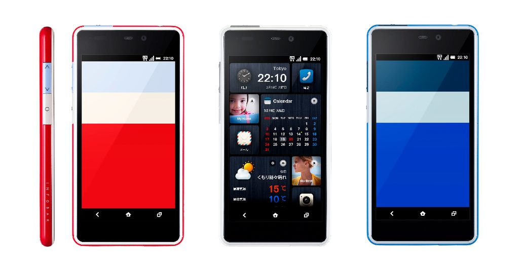
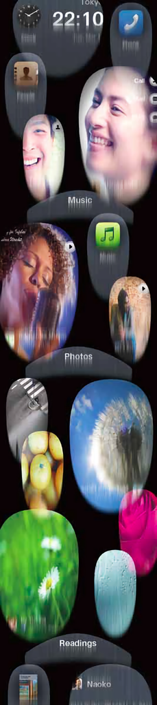
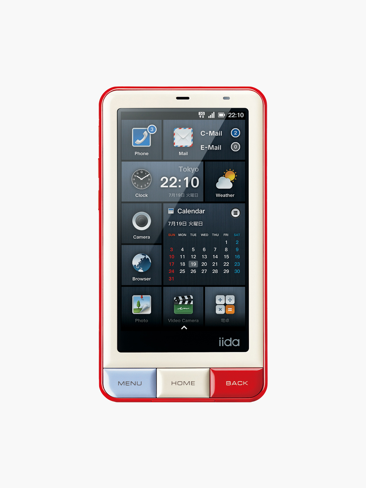
    INFOBAR A02 の企画・開発を進めていたのは、スマホ普及が加速し、LINE やYouTubeが市民権を得、アーリーアダプター層がInstagramを使い始めた2012 年。そうした時代背景から、SNS や写真、動画、音楽の快適な体験を目指して「すぐPLAY、すぐシェア」を基本コンセプトに置きました。iida UIは、SNSやクラウドに最適化されたiida UI 2.0 へとアップデート。クラウド上の画像、音楽アルバム、ともだち、Facebookなどをホーム画面にパネルとして配置することができます。スクロールするとパネルがゼリーのように「ぷにぷに」動く従来にない感触、質感も実現しました。さらに、iida UI のパネルとハードキーの寸法・位置を揃えるなど、プロダクトとUIを高次元で同調させ、境のない一つの塊に仕上げています。そのシームレスな姿を深澤さんは、外見と中身を別々に作って組み合わせる「もなか」でなく、中身だけ、すなわち「ようかん」だと表現しました。「シェア」に最適化された形態を徹底的に追求し、高い完成度で具現化したINFOBAR A02。製造メーカーは台湾のHTC 社。au Design project 開始以来初の海外メーカー製でした。

    “Monaka” and “Yokan”

    INFOBAR A02 was planned and developed in 2012, a time when smartphone adoption was accelerating, LINE and YouTube were becoming firmly established in everyday life, and early adopters were beginning to use Instagram. Against this backdrop, the basic concept was “Play instantly, share instantly,” with the aim of creating a seamless experience for social media, photos, video, and music.

    The iida UI was updated to iida UI 2.0, optimized for social media and cloud services. Images stored in the cloud, music albums, friends, Facebook, and other content could be placed directly on the home screen as panels. When scrolling, the panels responded with a soft, jelly-like “squishy” motion, creating a tactile quality unlike anything seen before.

    The product design and UI were also synchronized at a highly refined level—for example, by aligning the dimensions and positions of the iida UI panels with the physical hardware keys—so that the device would feel like a single, seamless whole.

    Naoto Fukasawa described this seamless quality not as “monaka,” a Japanese confection in which the outer shell and filling are made separately and then combined, but as “yokan,” a solid block of sweet bean jelly in which there is no distinction between outside and inside.

    INFOBAR A02 pursued a form optimized for “sharing” with exceptional thoroughness and realized it at a remarkably high level of refinement. It was manufactured by Taiwan-based HTC, making it the first au Design project model produced by an overseas manufacturer.


    iida UI 2.0
    Icon & Theme: Masaki Hoshino
    Font: Masanori Sakamoto


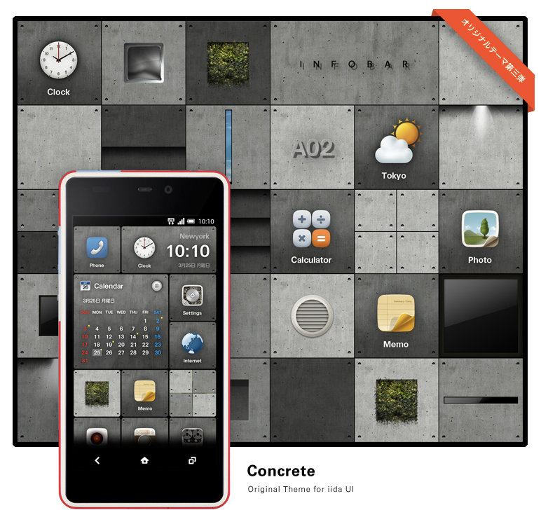
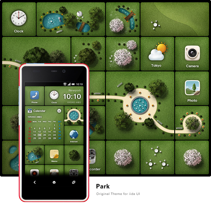
    iida UI 2.0 オリジナルテーマ / iida UI 2.0 Original theme

  • INFOBAR C01

    INFOBAR C01

    ANNOUNCEMENT DATE2012.01.16
    RELEASE DATE2012.02.03
    Brandiida
    TypeProduction Model
    DesignerProduct: Naoto Fukasawa
    UI: Yugo Nakamura
    ProducerSatoshi Sunahara
    ManufacturerSHARP
    Size ( W x H x D ) / Weight52 × 130 × 12.3(maximum thickness 12.5) mm / 106g
    MaterialsPlastic, tempered glass display, electronic components

    COLOR VARIATIONS

    NISHIKIGOI / ICHIMATSU / KIIRO


    AWARDS

    • 2012年度グッドデザイン賞 / Good Design Award 2012

    MUSEUM COLLECTIONS


    ABOUT

    「手」とスマホ

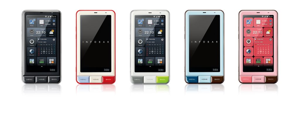
    携帯電話の設計にあたっては幅49mmが手にしっくりくる最適値とされていました。ディスプレイが大型化するにつれて理想的な幅の実現が困難になっても、なんとか50mm台前半に収めようと、デザイナーもエンジニアもコンマ1mmの戦いに挑んでいました。スマートフォンはそんな概念を一気に吹き飛ばし、60mmを超える幅が当たり前になりました。指先の記憶で見ずに打てたキーも、タッチパネルを見ないと打てなくなりました。「視覚」や「脳」が優先されるスマートフォン。「手」や「身体性」を大切にしていた携帯電話。携帯電話の良さを残しながらスマートフォン化を試みたのがINFOBAR C01です。幅は52mm、INFOBARらしいタイルキーもそのままです。 

    The “Hand” and the Smartphone

    In mobile phone design, a width of 49 mm was considered ideal for fitting comfortably in the hand. As displays grew larger and achieving that ideal width became increasingly difficult, designers and engineers fought over every tenth of a millimeter in an effort to keep the width within the low-50 mm range.

    Smartphones swept away that notion almost overnight, and widths exceeding 60 mm quickly became the norm. Physical keys that could once be operated without looking, guided by the memory of one’s fingertips, gave way to touchscreens that demanded visual attention.

    Smartphones prioritize vision and the brain. Mobile phones placed greater importance on the hand and our physical relationship with the device.

    INFOBAR C01 was an attempt to create a smartphone while preserving these qualities of the mobile phone. At just 52 mm wide, it retained the distinctive tile keys that had become an INFOBAR signature.


    Photography by Satoshi Sunahara
  • INFOBAR A01

    INFOBAR A01

    ANNOUNCEMENT DATE2011.05.17
    RELEASE DATE2011.06.30
    Brandiida
    TypeProduction Model
    DesignerProduct: Naoto Fukasawa
    UI: Yugo Nakamura
    ProducerSatoshi Sunahara
    ManufacturerSHARP
    Size ( W x H x D ) / Weight63 × 118 × 11.8 mm / 113g
    MaterialsPlastic, tempered glass display, electronic components

    COLOR VARIATIONS

    KURO / NISHIKIGOI / HACCA / CHICOMINT / CHOCOPINK


    AWARDS

    • 2011年度グッドデザイン賞 / Good Design Award 2011

    MUSEUM COLLECTIONS


    ABOUT

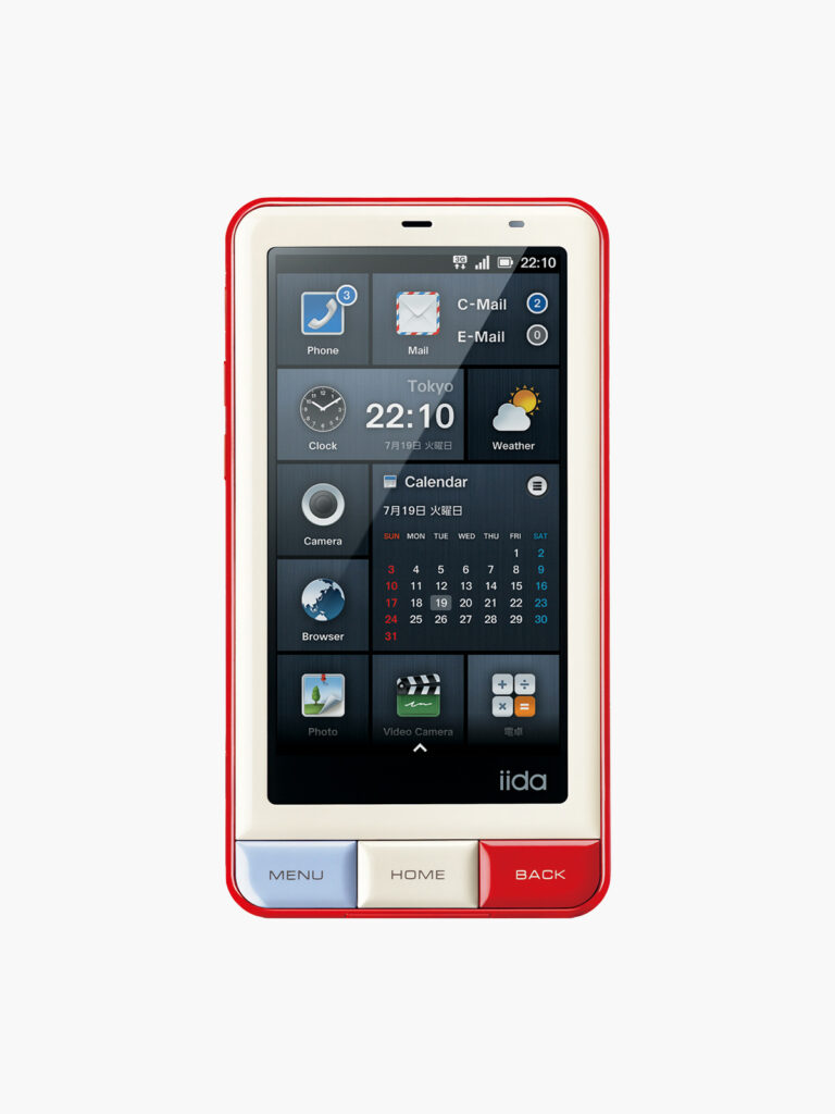
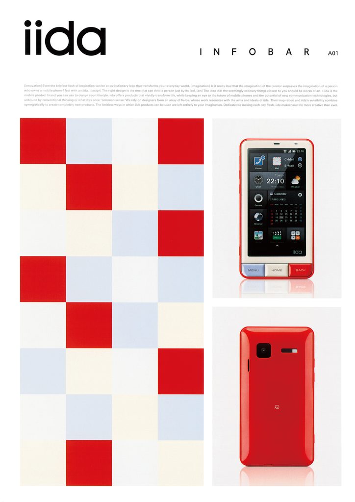
    プロダクトデザインとUI デザインの一体化

    2010 年は、スマホ・SNS 黎明期の高揚した感覚に包まれていた年でした。iPhoneを手にし、Twitter、 Facebookを使い始め、Ustreamで中継されるイベントや音楽ライブに感動する。時代が今まさに変わりつつある空気の中で、Android搭載INFOBARの企画を進めていました。スマートフォン化の肝は何と言ってもユーザーインターフェース(UI)デザインです。企画書に「プロダクトデザイナー深澤直人さん×インターフェースデザイナー中村勇吾さん」と考えうる最強のコンビネーションを記し、ワクワクしたことを思い出します。かくして、INFOBARを象徴するタイルキーが配された柔らかでフレンドリーな形と、その形と破綻なく一体化するiida UIとから成るINFOBAR A01が誕生しました。当時、Android のUIはまだ未熟でアイコンのデザインも玉石混交の状態でした。中村勇吾さんは「モジュール」「コンポジション」という設計思想で、どんなアイコンがきても美しく、かつユーザーが自由にカスタマイズできるファッション性と遊び心を備えたUIを生み出したのでした。

    Integrating Product Design and UI Design

    2010 was a year filled with the excitement of the emerging smartphone and social media era. We were getting our hands on iPhones, beginning to use Twitter and Facebook, and marveling at events and live music performances streamed on Ustream. Amid the palpable sense that the world was changing before our eyes, we began planning an Android-based INFOBAR.

    The key to transforming INFOBAR into a smartphone was, above all, the design of its user interface (UI). I still remember the excitement of writing what seemed like the ultimate combination in the project proposal: “Product designer Naoto Fukasawa × Interface designer Yugo Nakamura.”

    And so INFOBAR A01 was born, combining a soft, friendly form featuring the tile keys that had become an INFOBAR signature with the iida UI, seamlessly integrated with the physical design.

    At the time, the Android UI was still relatively immature, and the quality of icon design varied widely. Drawing on the design principles of “modules” and “composition,” Yugo Nakamura created a UI that could accommodate any icon while maintaining a beautiful overall appearance. At the same time, it offered users the freedom to customize it themselves, bringing a sense of fashion and playfulness to the interface.


    iida_INFOBAR 035
    ラバー製ジャケット / Rubber Jacket

    iida UI

    Icon&Theme: Masaki Hoshino

    Font: Masanori Sakamoto

    Sound: Suguru Yamaguchi


    INFOBAR A01 カタログ表紙 / INFOBAR A01 Brochure Cover
    CD: Satoshi Takamatsu AD: Daisaku Nojiri
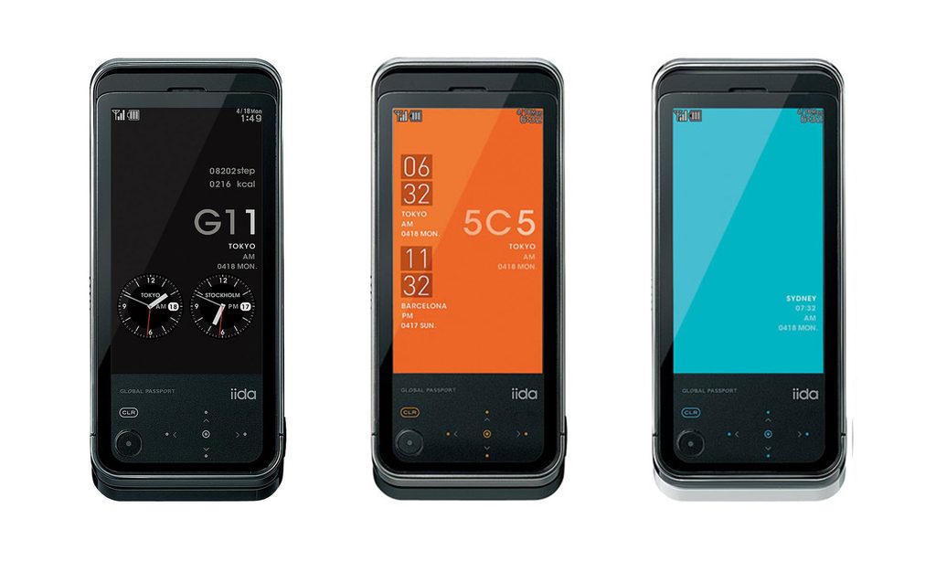
  • G11

    G11

    ANNOUNCEMENT DATE2010.10.18
    RELEASE DATE2011.03.25 / 03.26 (北海道) / 04.07(関東、東北)
    Brandiida
    TypeProduction Model
    DesignerIchiro Iwasaki
    ProducerSatoshi Sunahara
    ManufacturerSony Ericsson
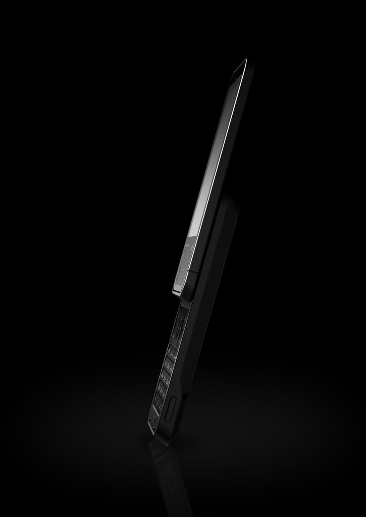
    Size ( W x H x D ) / Weight51 × 117 × 15.9 mm / 142g
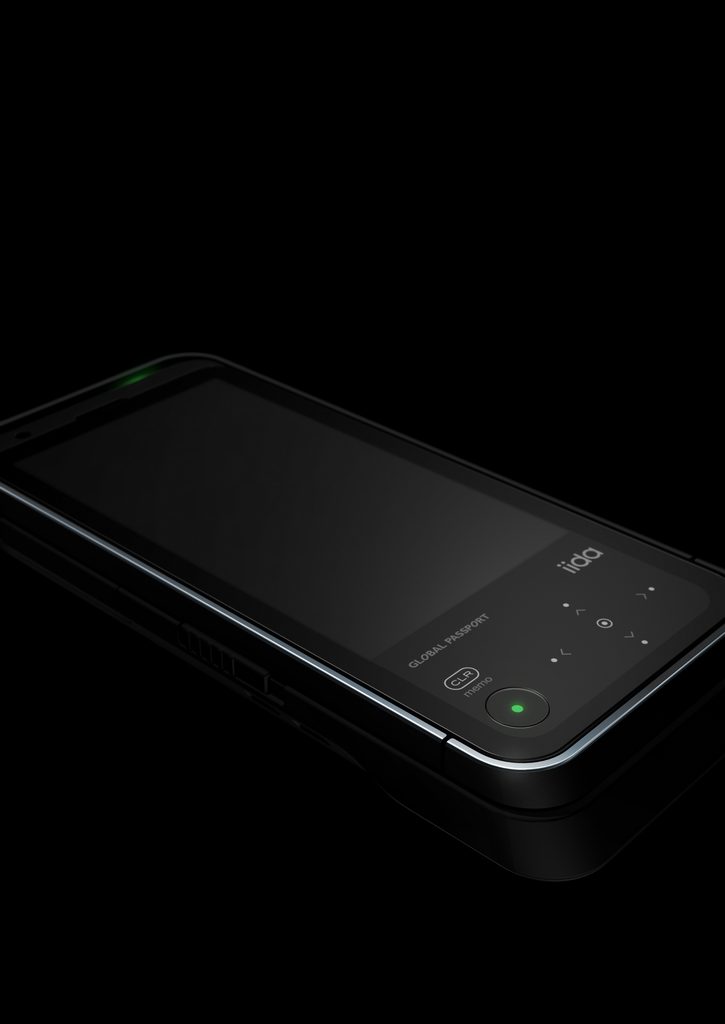
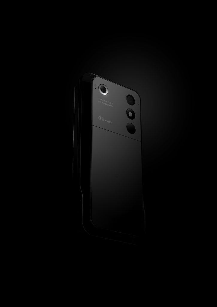
    MaterialsTempered glass display , ion-plated stainless steel frame, plastic back panel with ASC (Anti-Stain Coating), electronic components

    COLOR VARIATIONS

    BLACK + BLACK / ORANGE + BLACK / BLUE + WHITE


    AWARDS

    • 2011年度グッドデザイン賞 / Good Design Award 12011

    ABOUT

    デザインケータイの最終型

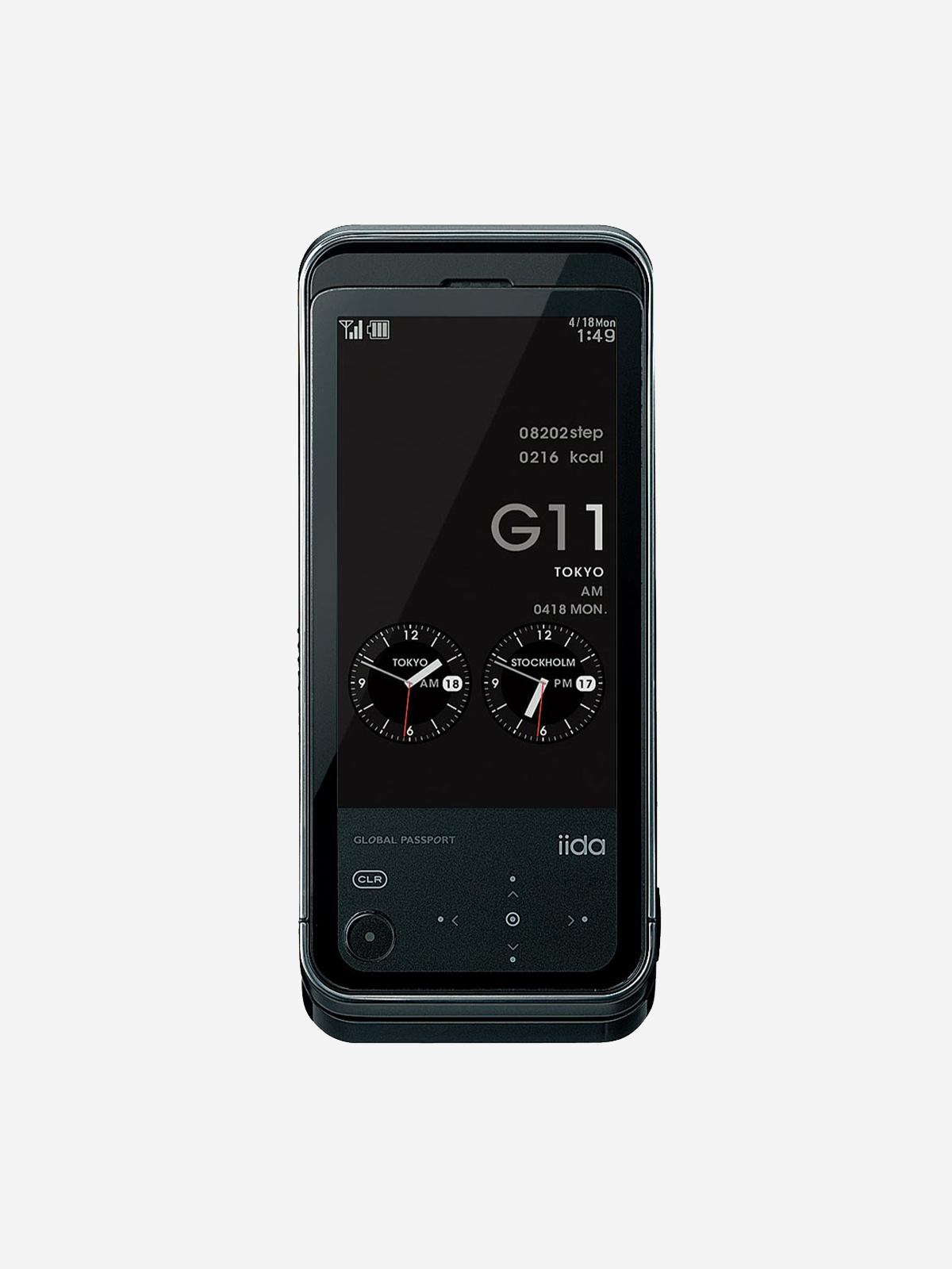
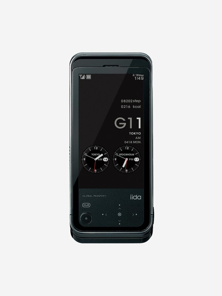
    2010 年4 月のミラノサローネは、アイスランドの火山噴火による火山灰の影響でヨーロッパの各空港が閉鎖されパニックに陥りました。帰国できなくなってしまった人々同士で、飛行機のフライト状況などさまざまな情報をシェアするために大いに役立ったのはTwitterでした。現地でのコミュニケーションにG9は大いに役立ったものの、SNS 時代に相応しいUI の必要性を実感しました。そこでG9 の後継機G11 の企画にあたっては、SNS 利用時のユーザービリティ向上を目的にタッチセンサーを採用することにしました。ケータイはガラケーと揶揄されるようになり、街中にはiPhone 4を手にした若い女性たちの姿が増えていました。2010 年11月にはauからAndroidスマートフォンIS03が発売。スマホ時代到来の只中でG11 の開発は進められました。G11が発売されたのは2011 年3 月25日、東日本大震災発生から2 週間後のことでした。実質的に最後のデザインケータイとなったG11。ラストを飾るにふさわしい高い完成度を誇るモデルです。

    The Final Form of the Design Phone

    The Milan Design Week in April 2010 was thrown into chaos when volcanic ash from an eruption in Iceland forced airports across Europe to close. For those unable to return home, Twitter proved invaluable as a way to share flight updates and other information.

    While G9 served us well for communication during our time in Milan, the experience made us keenly aware of the need for a user interface better suited to the emerging age of social media. When planning G11, the successor to G9, we therefore decided to incorporate a touch sensor to improve usability when accessing social networking services.

    By then, conventional Japanese mobile phones were increasingly being derided as “Galapagos phones” (garakei), while more and more young women could be seen around the city carrying iPhone 4s. In November 2010, au launched the IS03, an Android smartphone. Development of G11 proceeded amid this rapid transition into the smartphone era.

    G11 was released on March 25, 2011, just two weeks after the Great East Japan Earthquake.

    In effect, G11 was the last of the design phones. With its exceptional level of refinement and completeness, it was a model worthy of bringing the era to a close.


  • X-RAY

    X-RAY

    ANNOUNCEMENT DATE2010.10.18
    RELEASE DATE2010.11.05
    Brandiida
    TypeProduction Model
    DesignerProduct: Tokujin Yoshioka UI: groovisions
    ProducerSatoshi Sunahara
    ManufacturerTOSHIBA
    Size ( W x H x D ) / Weight49 × 110 × 15.7 mm / 123g
    MaterialsPlastic(TARFLON NEO™ : Siloxane copolymer polycarbonate etc.), electronic components

    COLOR VARIATIONS

    Photography by Takumi Ota

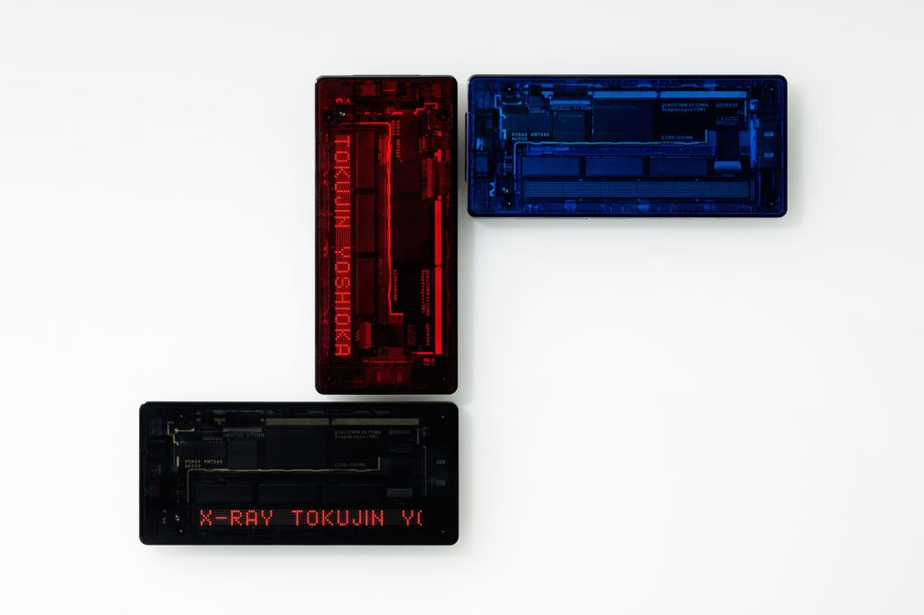
    RED / BLACK / BLUE


    AWARDS

    • 2011年度グッドデザイン賞 / Good Design Award 2011

    ABOUT

    形を超えて

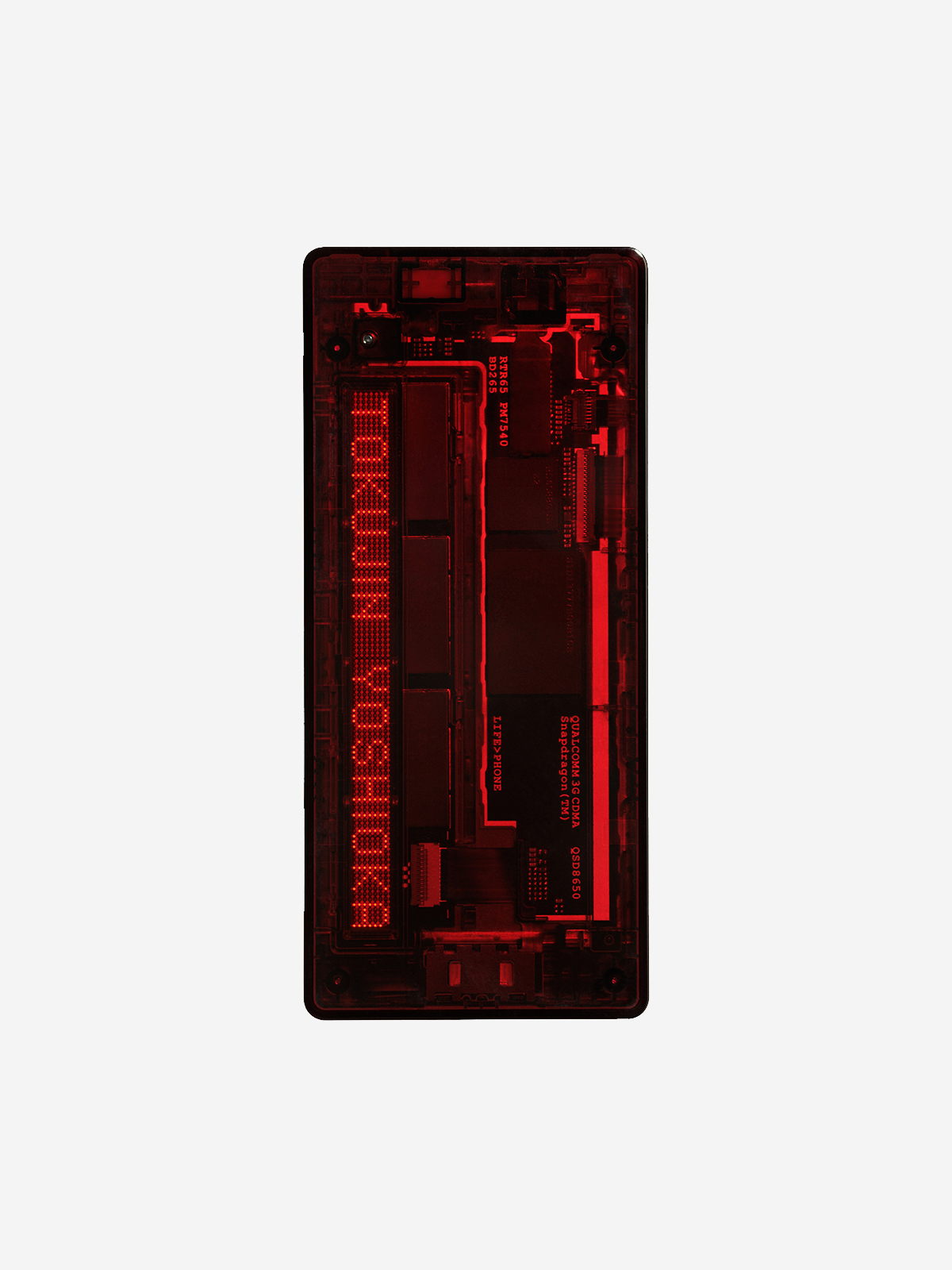
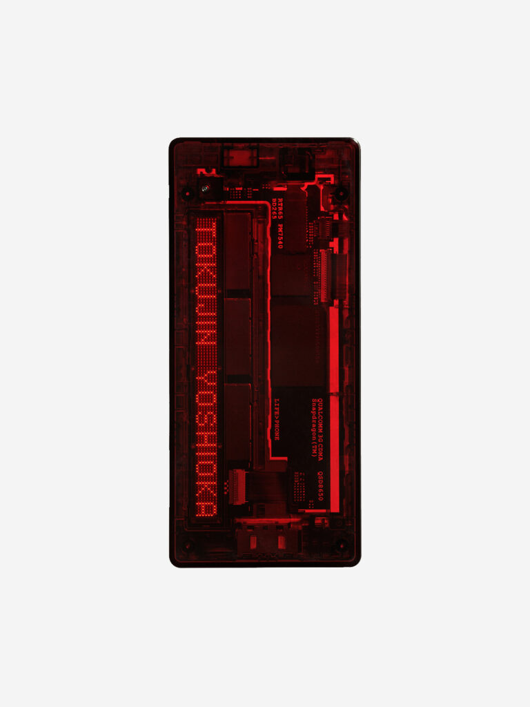
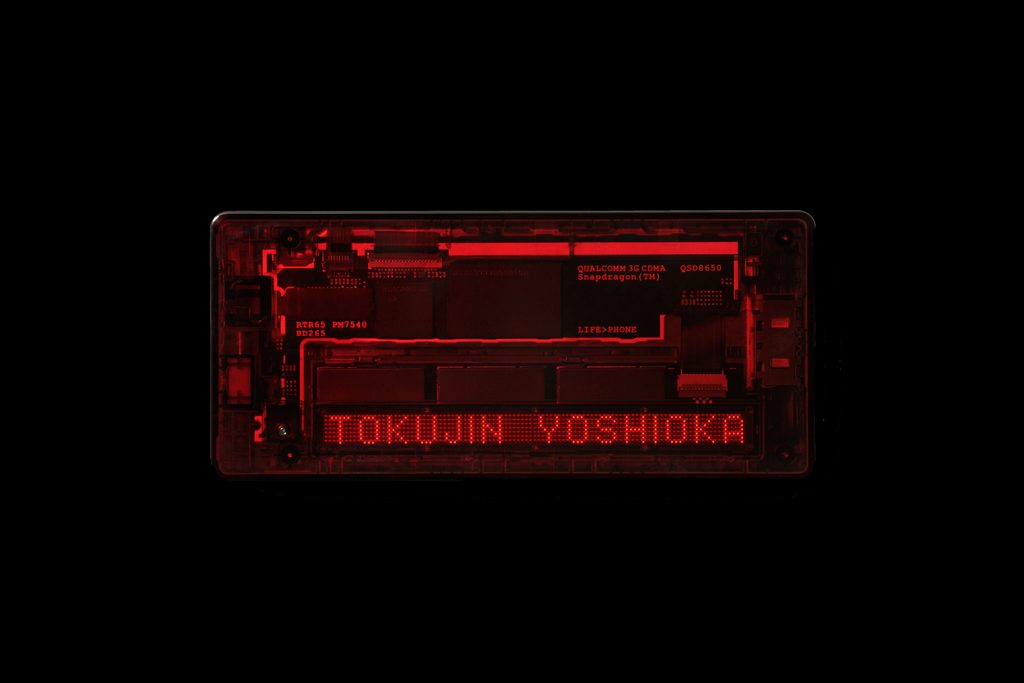
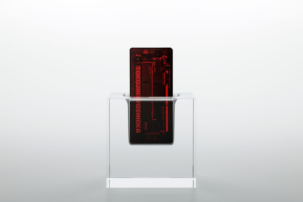
    コンセプトは「表面のカタチ作りから離れ、内側からデザインする事でまるでカタチが存在しないような携帯電話」(吉岡徳仁)。デザインの主役は外装ではなく透けて見える内部です。黒いプリント基板の上にはLEDユニット及びドライバIC、液晶画面のバックライト制御用IC、超小型バイブモーターなどが美しくレイアウトされています。“QUALCOMM 3G CDMA”、“LIFE>PHONE”など基板に書かれた英数字のフォント、サイズ、位置も計算されています。深い色¥味を帯びた透明ケースは、ポリカーボネートにガラス繊維を配合することで高強度と高透明性を実現した新素材「タフロン ネオαシリーズ」製。米国の現代アーティスト、ジェニー・ホルツァーの電光掲示版アートを彷彿させるLEDディスプレイ表示は、当時最新の7×10²ドット超高密度ドットマトリクスLEDディスプレイで実現しました。X-RAYは、単なる電子機器を超越し、アートの域へと達した携帯電話です。

    Beyond Form

    The concept was “a mobile phone that seems almost to have no form at all, created by moving away from shaping its surface and instead designing it from the inside out” (Tokujin Yoshioka). Rather than the exterior, it is the internal components visible through the transparent body that take center stage in the design.

    On the black printed circuit board, components such as LED units and driver ICs, an IC controlling the LCD backlight, and an ultra-compact vibration motor are carefully arranged to create a visually refined composition. Even the typeface, size, and positioning of alphanumeric markings printed on the circuit board, including “QUALCOMM 3G CDMA” and “LIFE > PHONE,” were meticulously considered.

    The deeply tinted transparent casing is made from Toughlon Neo α Series, a new material combining polycarbonate with glass fiber to achieve both high strength and exceptional transparency.

    The LED display, reminiscent of the electronic signboard works of American contemporary artist Jenny Holzer, was realized using what was then a state-of-the-art 7 × 10²-dot ultra-high-density dot-matrix LED display.

    X-RAY is a mobile phone that transcends the realm of the electronic device and approaches the realm of art.


    Photography by Takumi Ota
    X–RAY SOLID STAND
    Photography by Takumi Ota
  • LIGHT POOL

    LIGHT POOL

    ANNOUNCEMENT DATE2010.07.13
    RELEASE DATE2010.07.30
    Brandiida
    TypeProduction Model
    DesignerProduct: Hironao Tsuboi
    Sound & Illumination: Masakatsu Takagi
    ProducerSatoshi Sunahara
    ManufacturerTOSHIBA
    Size ( W x H x D ) / Weight50 × 110 × 17.8 mm / 132g
    MaterialsPlastic, electronic components

    COLOR VARIATIONS

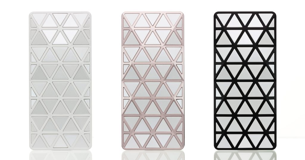
    WHITE / PINK / BLACK


    AWARDS

    • 2010年度グッドデザイン賞 / Good Design Award 2010

    ABOUT

    建築・光・音楽

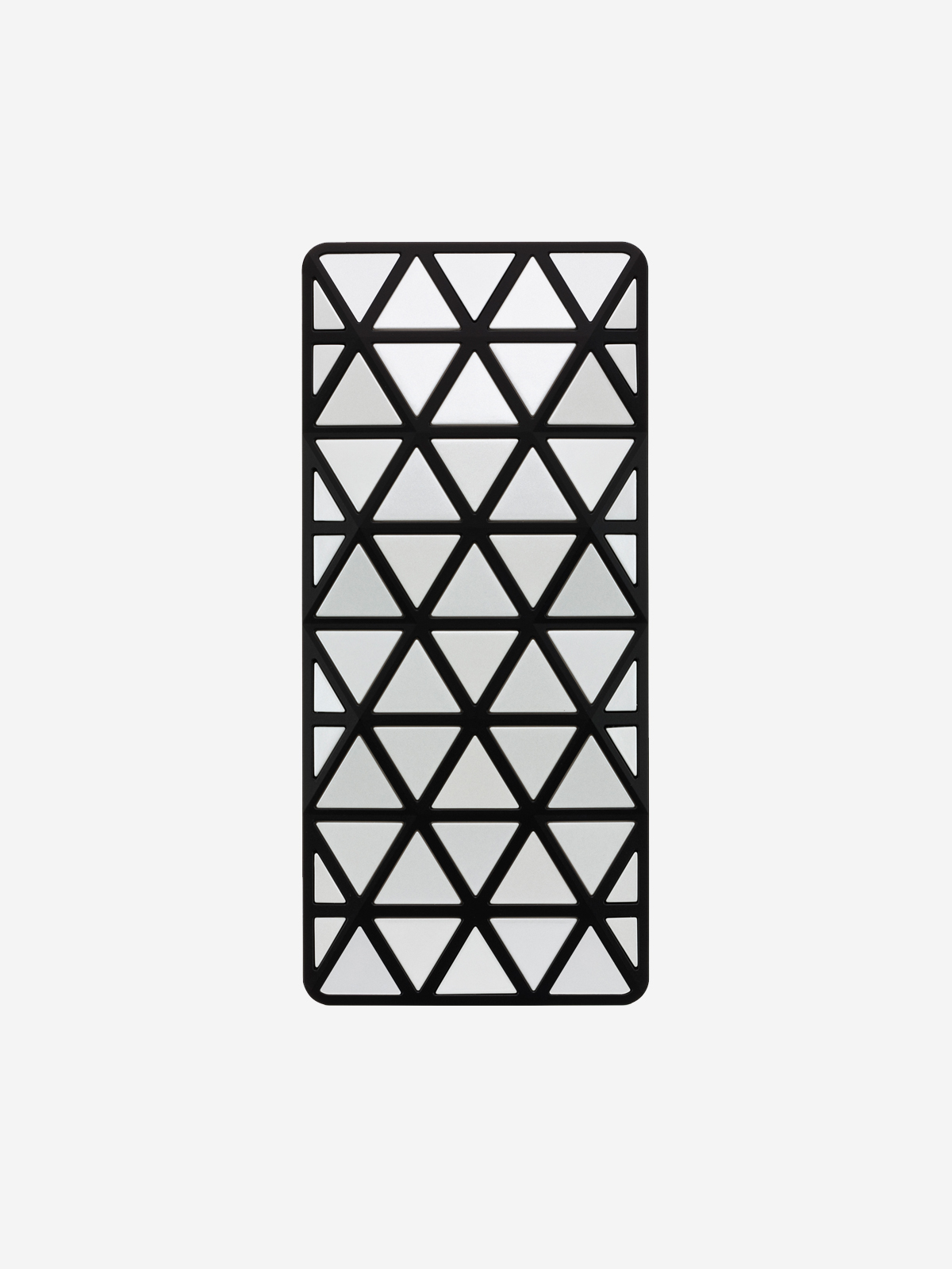
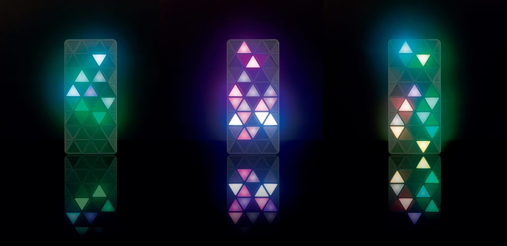
    LIGHT POOL のデザイナー坪井浩尚さんは1980 年生まれ。PLYと同じくLIGHT POOLも30代前後の若手デザイナーによる新しい表現の可能性を追い求めた携帯電話でした。建築のトラス構造から着想を得た三角形の窓が印象的な造形です。この窓には22 個ものLEDが備えられており、音楽家・映像作家である高木正勝さんが光の演出と楽曲を手がけた美しいイルミネーションが煌めきます。着信時・開閉時の点灯パターンは60 種類以上。また「ロングプレイモード」では、オリジナル楽曲10 種類に合わせてイルミネーションを長時間楽しむことができます。「ロングプレイモード」用に制作された高木さんの楽曲は「Music for iida“Light Pool”」というアルバムにまとめられ、iTunes Storeを始め各種音楽サービスで配信されています。周りの環境や人と作用することによって新たな景色を作り出す携帯電話です。

    Architecture, Light, and Music

    LIGHT POOL was designed by Hironao Tsuboi, who was born in 1980. Like PLY, LIGHT POOL was a mobile phone that explored new possibilities of expression through the work of a young designer then around the age of thirty.

    Its distinctive form is defined by triangular windows inspired by the truss structures used in architecture. Behind these windows are no fewer than 22 LEDs, producing beautiful illuminations created by musician and visual artist Masakatsu Takagi, who designed both the lighting sequences and the music.

    More than 60 lighting patterns appear for incoming calls and when the phone is opened or closed. In “Long Play Mode,” the illuminations can be enjoyed for extended periods in synchronization with 10 original pieces of music.

    Takagi’s compositions created for Long Play Mode were compiled into an album titled Music for iida “Light Pool” and made available through the iTunes Store and other music services.

    LIGHT POOL is a mobile phone that creates new scenes through its interaction with the surrounding environment and the people around it.


    Music for iida “Light Pool”

    Masakatsu Takagi

    「ロングプレイモード」用に制作された楽曲をまとめたアルバム。Apple Music, Spotifyなど各種音楽サービスで配信されています。

    An album featuring a collection of tracks created for “Long Play Mode.” Available on Apple Music, Spotify, and other music streaming services.

    Apple Music / Spotify

  • lotta

    lotta

    ANNOUNCEMENT DATE2010.01.28
    RELEASE DATE2010.02.19
    Brandiida
    TypeProduction Model
    DesignerIchiro Iwasaki
    ProducerSatoshi Sunahara
    ManufacturerKYOCERA
    Size ( W x H x D ) / Weight49 × 100 × 14.6 (maximum thickness 17)mm / 108g
    MaterialsPlastic, electronic components

    COLOR VARIATIONS

    white / yellow / green


    AWARDS

    • 2010年度グッドデザイン賞 / Good Design Award 2010

    ABOUT

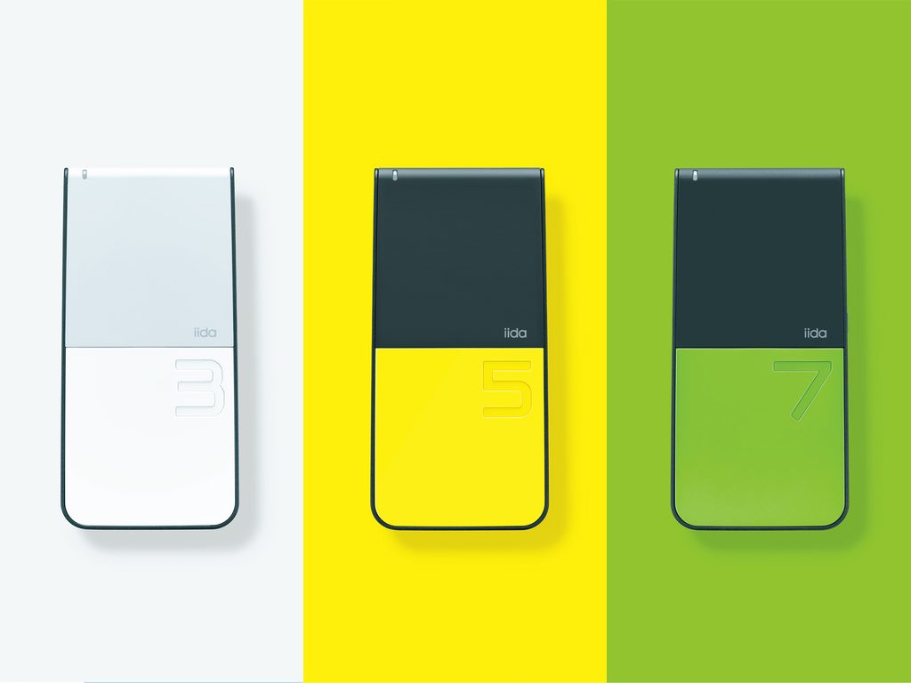
    バランス感覚

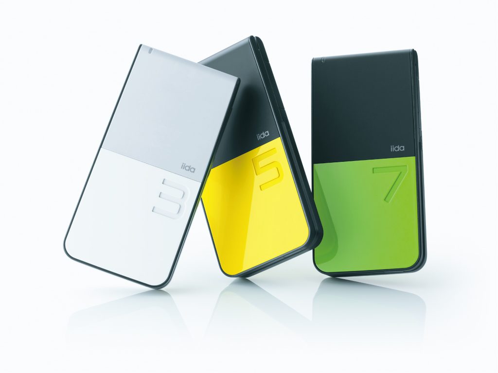
    シンプルな機能・低価格・高いデザイン性の三つを柱に据えたiida ベーシックモデルの第3弾です。美しいツートンカラーに奇数「3」「5」「7」を大胆にあしらった品性と遊び心を感じさせるデザイン。「大切なのはバランス感覚。上品さとカジュアルさ、強さと柔らかさ、シンプルさと丁寧さ。それらのバランスの中から、モノとしての存在感が生まれ、そしてそれが、ちょうど良く心に留まるぐらいの個性となって現れます」(岩崎一郎)。岩崎さんが手がけたA5405SA(2004 年、三洋マルチメディア鳥取)の流れを汲む折りたたみ式携帯電話デザインの秀作です。造形、色彩、素材、仕上げすべての面において絶妙なバランス感覚をlottaは実現しています。

    A Sense of Balance

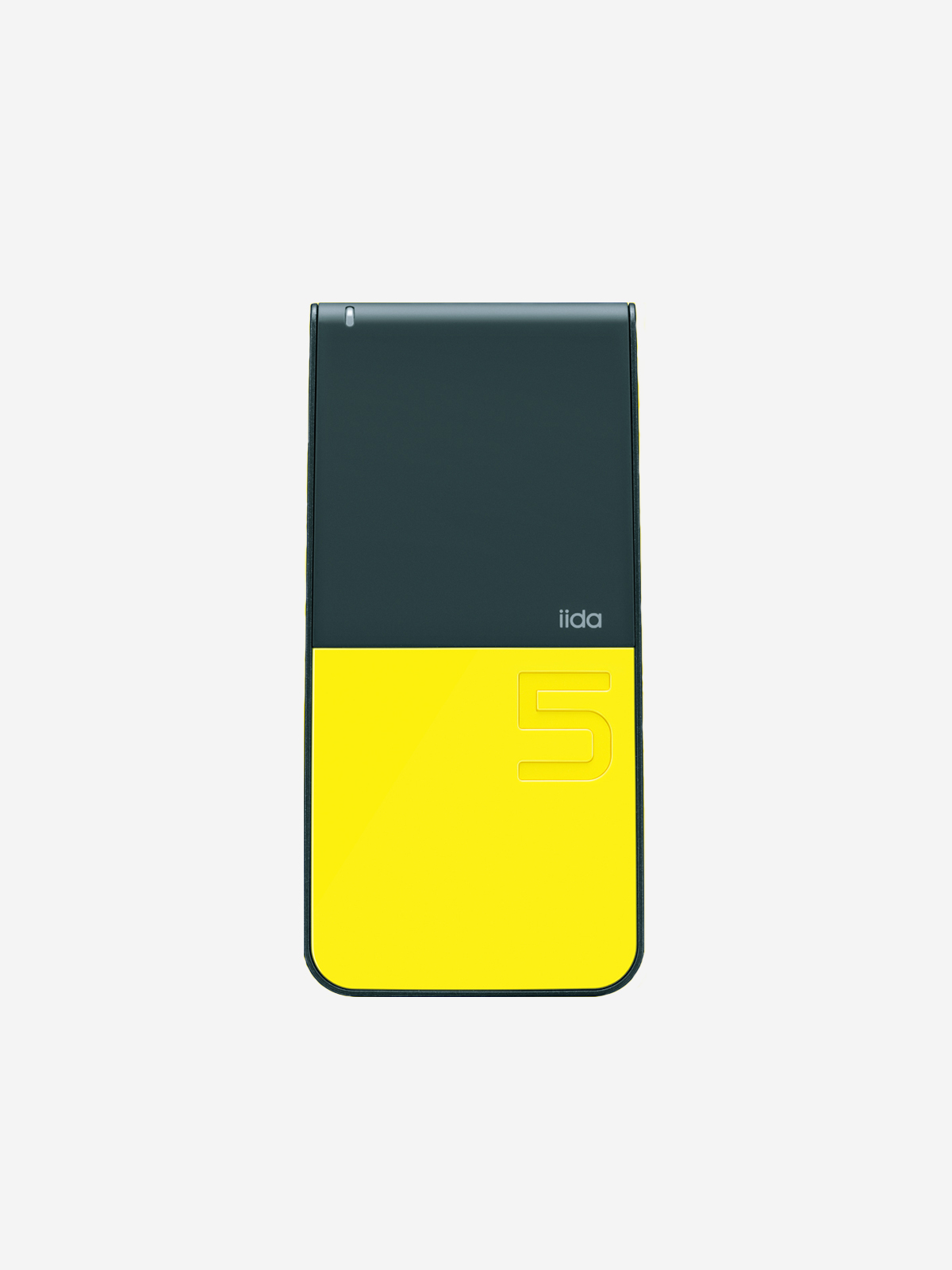
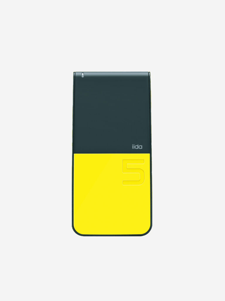
    lotta was the third model in the iida basic series, built around three core principles: simple functionality, affordability, and sophisticated design.

    Its beautiful two-tone color scheme, boldly accented with the odd numbers “3,” “5,” and “7,” gives the design a sense of both refinement and playfulness.

    “What matters is a sense of balance: between elegance and casualness, strength and softness, simplicity and attention to detail. From the balance between these qualities comes a sense of presence as an object, which in turn becomes a distinctive character—just enough to stay in the mind.” (Ichiro Iwasaki)

    Building on the design approach of Iwasaki’s A5405SA (2004, Sanyo Multimedia Tottori), lotta is an outstanding example of folding mobile phone design.

    In every aspect—form, color, materials, and finish—lotta brings these elements into exquisite balance.


  • PRISMOID

    PRISMOID

    ANNOUNCEMENT DATE2009.09.09
    RELEASE DATE2009.12.01
    Brandiida
    TypeProduction Model
    DesignerNaoto Fukasawa
    ProducerSatoshi Sunahara
    ManufacturerKYOCERA
    Size ( W x H x D ) / Weight49 × 101 × 16.8 mm / 102g
    MaterialsPlastic, electronic components

    COLOR VARIATIONS

    GREEN / MAT BROWN / WHITE


    AWARDS

    • 2009年度グッドデザイン賞 / Good Design Award 2009

    ABOUT

    未来的未来:80年代デザインへのオマージュ

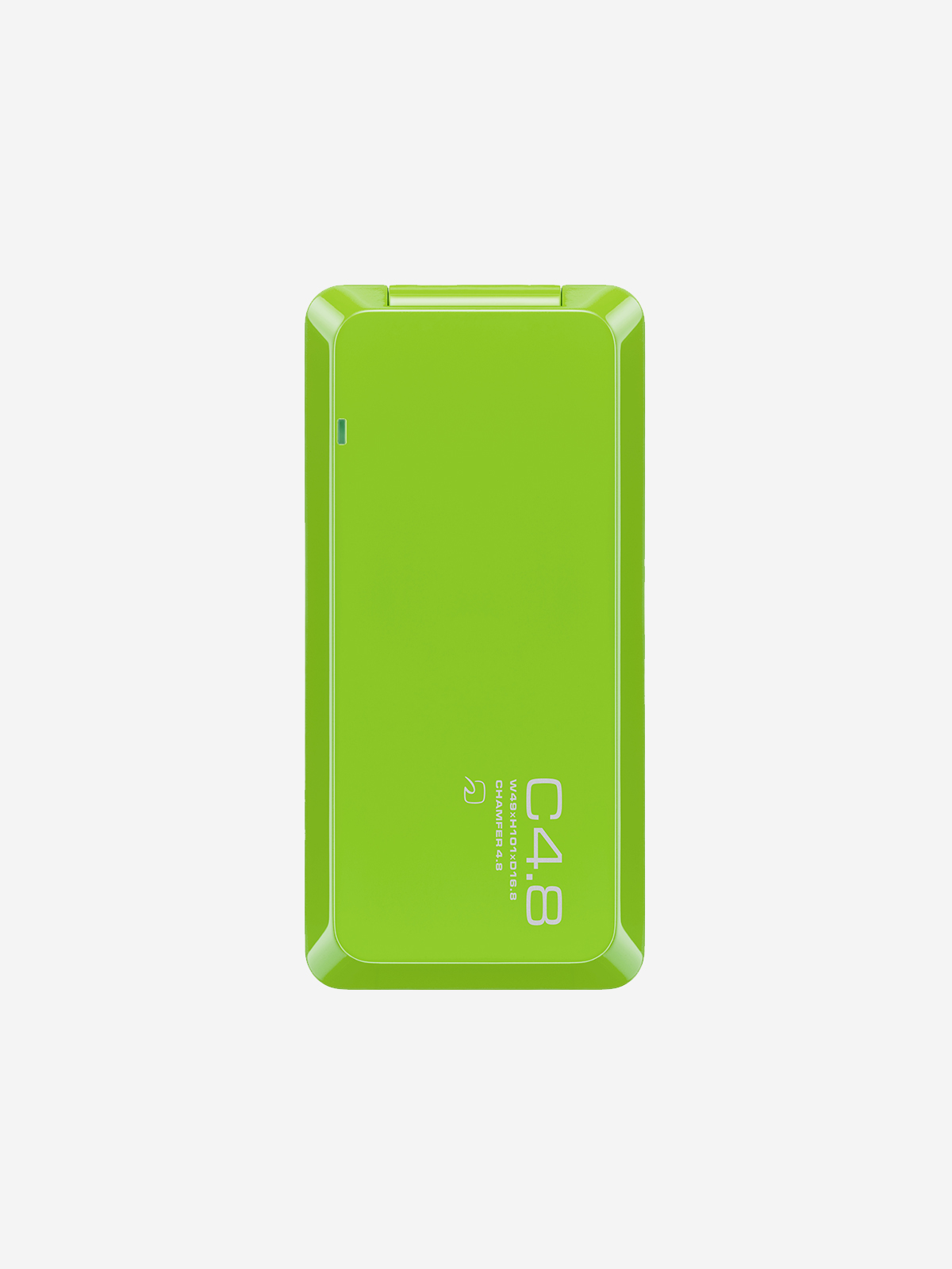
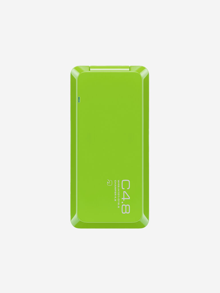
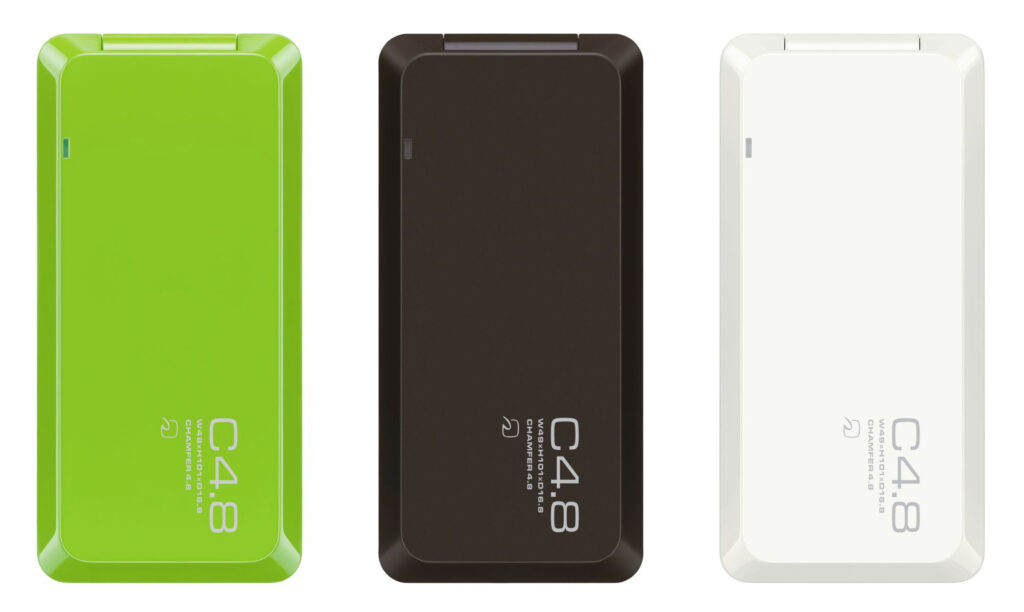
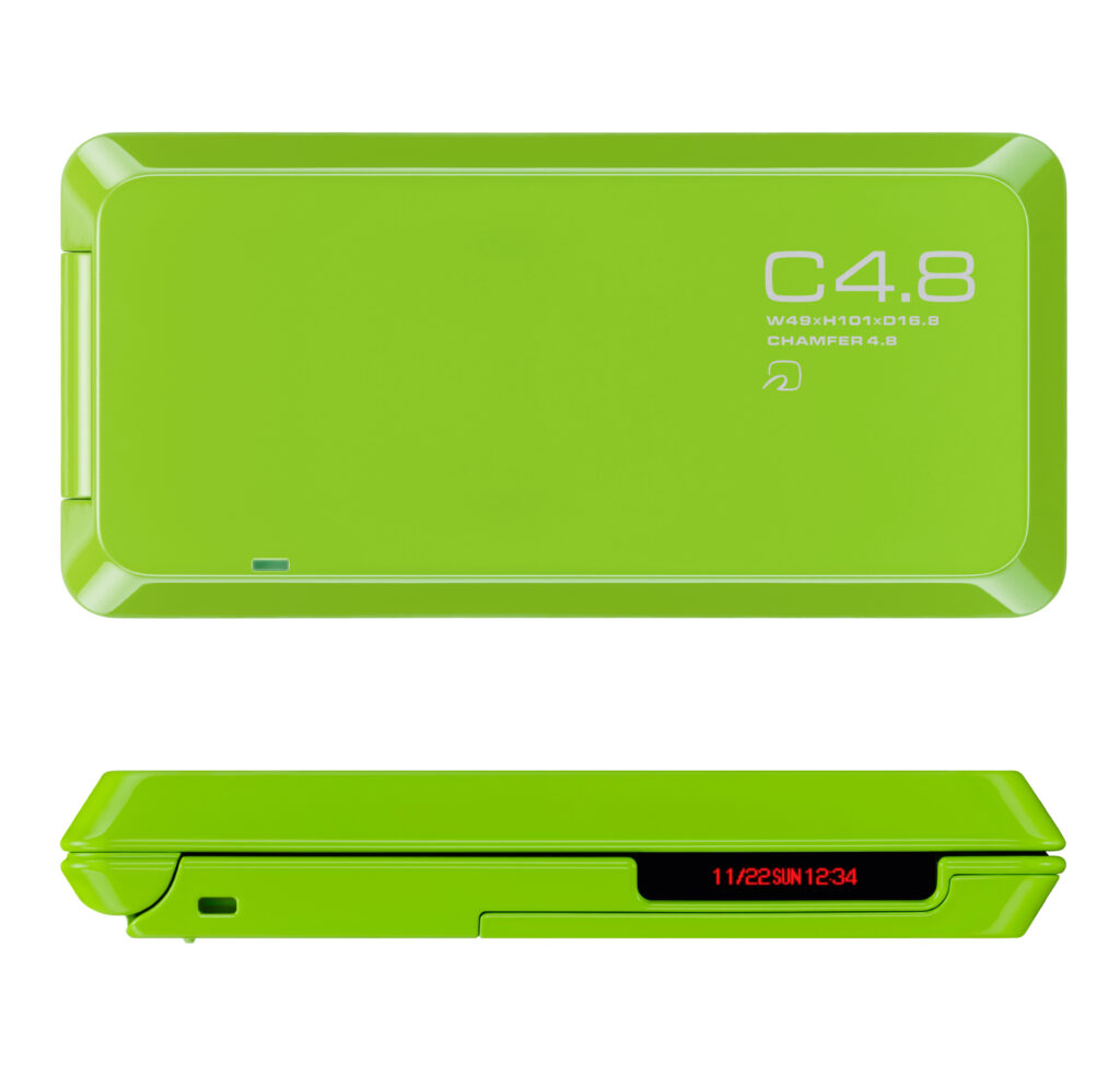
    iida ベーシックモデルの第2 弾。PRISMOID のコンセプト「未来的な未来」には80年代の工業デザインに対するオマージュが込められています。PRISMOID(プリズモイド)は角錐台の意。SF 映画『ブレードランナー』で知られるデザイナー、シド・ミードが描いた未来の車のような平面と曲面で構成された造形。レトロフューチャー感溢れるサイドの赤色LEDディスプレイ。天面には未来的なMicrogrammaフォントでPRISMOID の面取り寸法「C4.8」が大きくあしらわれています。さらにその下には小さく幅・高さ・奥行きを表す数値が書かれています。こうした表現は、80年代の工業製品によく見られたものです。例えばキヤノンの一眼レフT90(1986 年、デザイン:ルイジ・コラーニ)。そのペンタ部には「Canon」「T90」のロゴと「MULTIPLE METERING SYSTEM」「COMPUTERIZED 3 MOTOR CONTROL」という文字列が誇らしげに配置されています。PRISMOIDはシンプル・ミニマルなデザイントレンドの中で、80 年代的デザイン表現の引用という遊び心を備えたユニークな製品でした。

    A Futuristic Future: An Homage to 1980s Design

    PRISMOID was the second model in the iida basic series. Its concept, “A Futuristic Future,” was conceived as an homage to the industrial design of the 1980s.

    The name PRISMOID refers to a truncated pyramid. Its form, composed of flat and curved surfaces, recalls the futuristic vehicles envisioned by Syd Mead, the designer and visual futurist renowned for his work on the science-fiction film Blade Runner. A red LED display on the side further enhances its distinctive retro-futuristic character.

    On the top surface, “C4.8”—the dimension of PRISMOID’s chamfer—is prominently displayed in the futuristic Microgramma typeface. Directly beneath it, smaller figures indicate the phone’s width, height, and depth. This kind of graphic treatment was often seen on industrial products of the 1980s.

    One example is Canon’s T90 SLR camera (1986, designed by Luigi Colani). Its pentaprism housing proudly displays not only the “Canon” and “T90” logos, but also phrases such as “MULTIPLE METERING SYSTEM” and “COMPUTERIZED 3 MOTOR CONTROL.”

    At a time when simple, minimalist design was the prevailing trend, PRISMOID stood out as a unique and playful product, deliberately referencing the visual language of 1980s industrial design.