カテゴリー: au Design project

  • Ubicot[Prototype]

    Ubicot[Prototype]

    ANNOUNCEMENT DATE2023.11.23
    RELEASE DATEー
    Brandau Design project
    TypeConcept Model
    DesignerNaoto Fukasawa
    ProducerSatoshi Sunahara
    Manufacturerー
    Size ( W x H x D ) / Weight54.5 × 72 × 33.5 mm / approx. 100g
    MaterialsPlastic, Glass, electronic components

    COLOR VARIATIONS

    White / Pink


    ABOUT

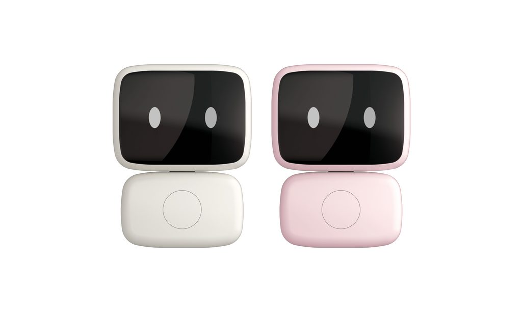
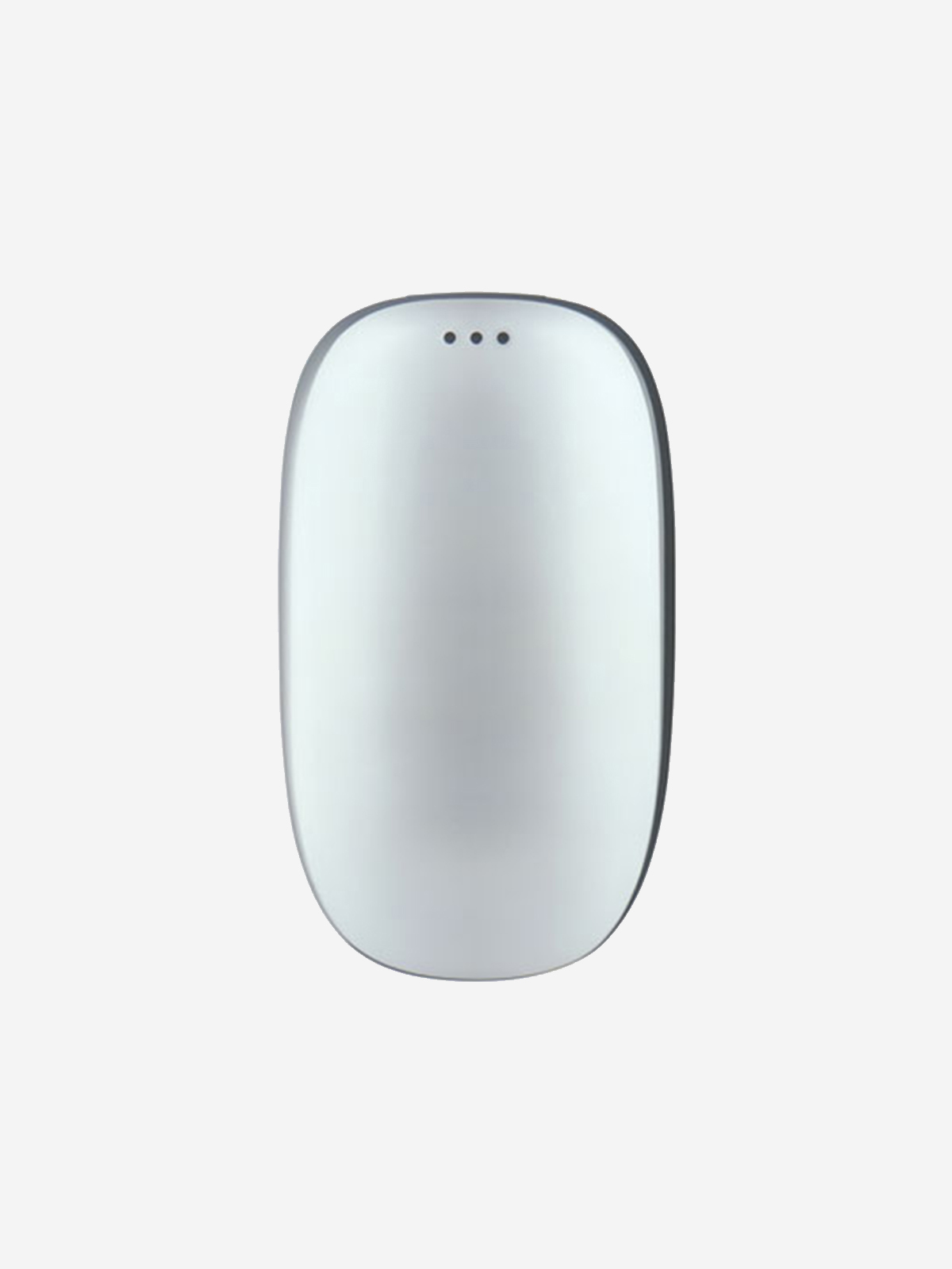
    AIに「身体」を与える

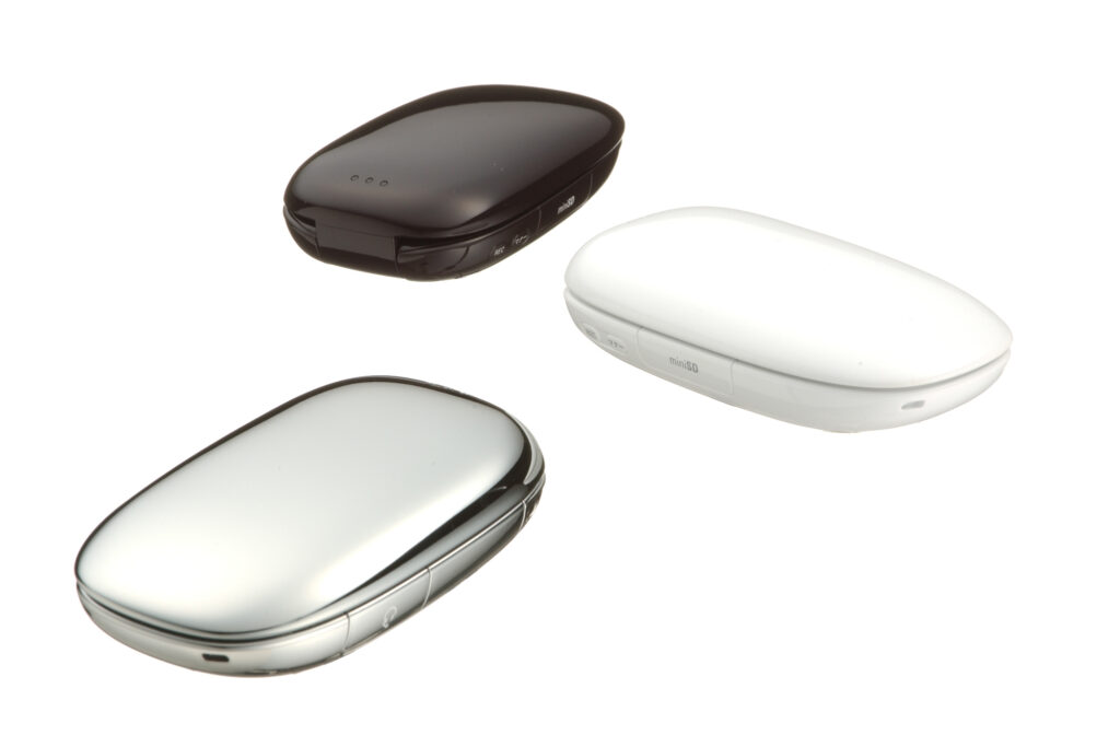
    生成AIが急速に進化し、スマートフォンやパソコンの画面の中でAIと会話することが日常になりつつあります。では、AIが画面の中だけでなく、私たちと同じ空間に存在するとしたら、どのような「かたち」がふさわしいのでしょうか。Ubicot(ユビコット)は、そんな問いから生まれた生成AIマスコットです。

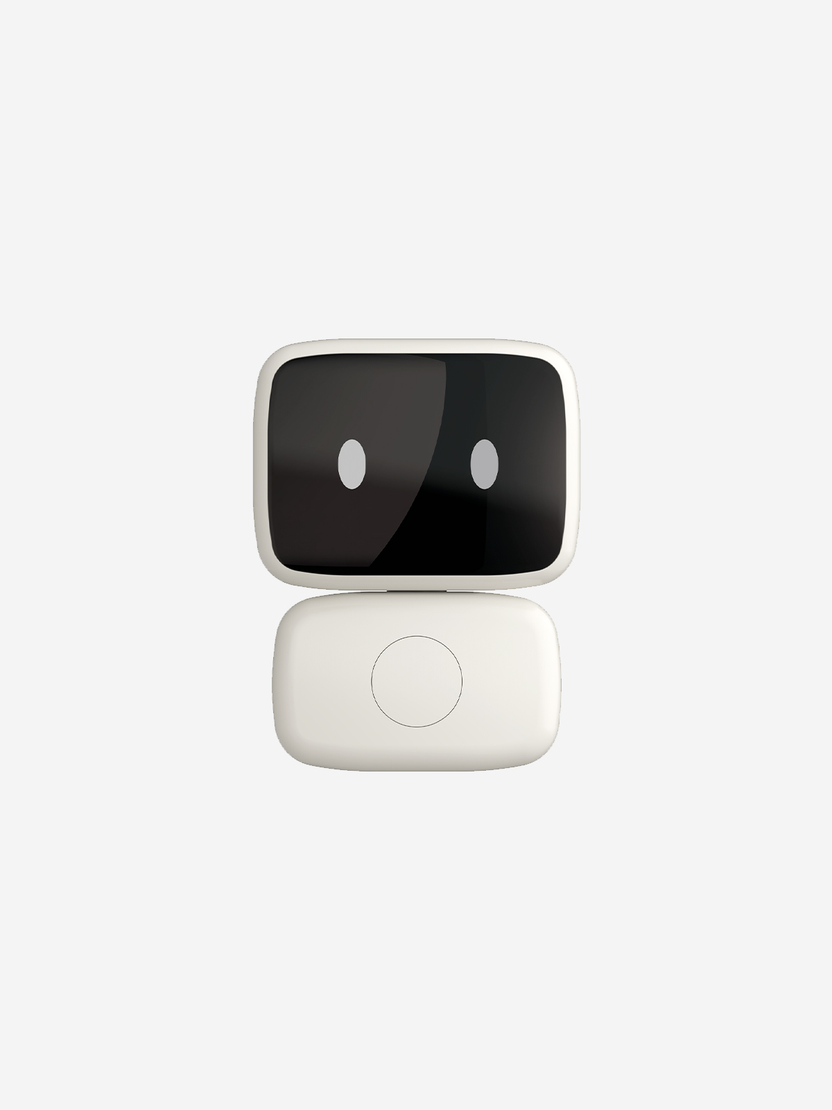
    目指したのは、小型ロボットやデジタルガジェットではなく、日常生活に自然に溶け込む知的で愛らしいインテリアオブジェのような存在。あるいは漫画やアニメの主人公にいつも寄り添う、妖精や使い魔のような「相棒」です。手のひらサイズの心地よい丸みを帯びたデザインは、INFOBARのデザイナーである深澤直人さんが手がけました。手足を持たず、目の動きと声という最小限の表現によってコミュニケーションするその姿を、深澤さんは「かわいいやつ」と表現しています。

    Ubicotの身体は、AIそのものではありません。生成AIによって形成されるUbicotの「魂(スピリット)」は、ユーザーの行動に合わせてスマートウォッチやパソコンなどさまざまなデジタル機器へと乗り移り、XR空間でもユーザーに寄り添います。つまり、身体はひとつでも、存在する場所はひとつではないのです。

    便利な機能を持つAIではなく、友達であり、相棒であり、ときには相談や悩みを打ち明けられるメンターのような存在へ。Ubicotは、生成AI時代における「人とモノとの新しい関係」をデザインする試みです。

    Giving AI a “Body”

    As generative AI evolves rapidly, talking with AI through the screens of smartphones and computers is becoming an everyday experience. But what if AI could exist not only on a screen, but in the same physical space as us? What kind of “form” would be right for such an AI? Ubicot was born from this question as a generative AI mascot.

    The aim was not to create a small robot or digital gadget, but something more like an intelligent and lovable interior object that naturally blends into everyday life—or a “companion,” like a fairy or familiar spirit that is always by the side of the protagonist in a manga or anime. Its palm-sized, softly rounded form was designed by Naoto Fukasawa, the designer of INFOBAR. With no arms or legs, Ubicot communicates through the minimal expressions of eye movements and voice. Fukasawa describes this character simply as “a cute little guy.”

    Ubicot’s body is not the AI itself. The “spirit” of Ubicot, shaped by generative AI, can inhabit a variety of digital devices—including smartwatches and computers—according to the user’s activities, and can accompany the user in XR spaces as well. In other words, while its body may be one, the places where it can exist are not.

    Rather than an AI defined by useful functions, Ubicot is envisioned as a friend, a companion, and sometimes even a mentor—someone to whom you can turn to share your thoughts and worries. Ubicot is an exploration of a new relationship between people and things in the age of generative AI.


    Ubicotは友達であり相棒であり相談や悩みを打ち明けら れたり助言をもらえるメンター的存在でもあります。言 うならば対話型AIの超小型マスコットです。声だけでな く顔の表情によっても対話が成立し疎通が生まれます。 言うならばゲゲゲの鬼太郎の父の目玉オヤジのような存 在でもあり、のび太に対するドラえもんのような存在で す。特徴はからだが小さく頭は昔のテレビの受像機のよ うな形をしています。目の動きだけでUbicotからの反応 が伝わってきます。表情はニュートラルですがカラダ全 体からくる印象はとてもかわいい存在です。顔の表示部 分はあらゆる情報を伝えてくれる画像情報としてのスク リーンでもあります。目の動きが伝えてくれる情報は対 話型AIの核となるインターフェースです。ヒューマノイ ドは人間型のロボットですがUbicotは最低限の表情と対 話だけで繋がれる「かわいいやつ」です。

    プロダクトデザイナー 深澤直人

    Ubicot is a friend, a companion, and also a mentor-like presence—someone you can turn to when you want to share your thoughts and worries, or seek advice. In other words, it is an ultra-compact mascot for conversational AI.

    Communication with Ubicot is established not only through voice, but also through facial expressions, creating a sense of connection and mutual understanding. In a sense, it is like Medama-Oyaji, the father’s eyeball in GeGeGe no Kitaro, or Doraemon to Nobita—a small companion who is always by your side.

    Its defining feature is its small body, with a head shaped like the picture tube of an old television set. Ubicot conveys its responses through nothing more than the movement of its eyes. While its facial expression remains neutral, the overall impression created by its body is exceptionally cute.

    The face is also a screen—a visual interface capable of conveying all kinds of information through images. The information communicated through the movement of its eyes is the core interface of conversational AI.

    Humanoids are human-shaped robots, but Ubicot is simply a “cute little guy” that connects with us through the most minimal combination of facial expression and conversation.

    Naoto Fukasawa
    Product Designer
  • INFOBAR 2

    INFOBAR 2

    ANNOUNCEMENT DATE2007.09.26
    RELEASE DATE2007.12.01
    Brandau Design project
    TypeProduction Model
    DesignerNaoto Fukasawa
    ProducerSatoshi Sunahara
    ManufacturerSANYO Multimedia Tottori
    Size ( W x H x D ) / Weight47 × 138 × 15.5 mm / 104g
    MaterialsPlastic, electronic components

    COLOR VARIATIONS

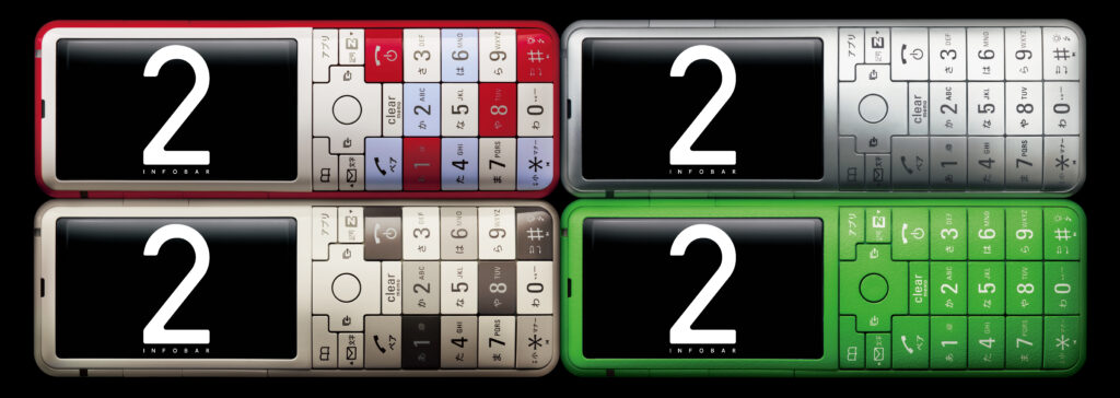
    NISHIKIGOI
    WARM GRAY
    SILVER
    MIDORI

    AWARDS

    • 2008年度グッドデザイン賞 / Good Design Award 2008

    MUSEUM COLLECTIONS


    ABOUT

    au Design project の集大成

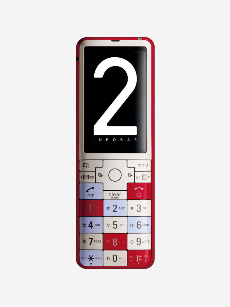
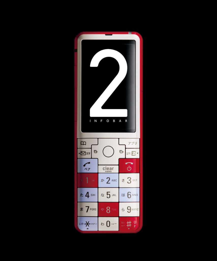
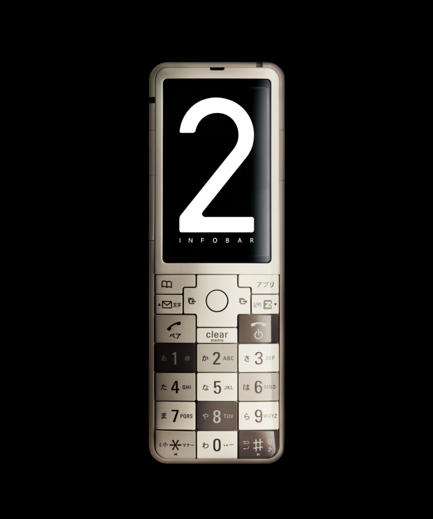
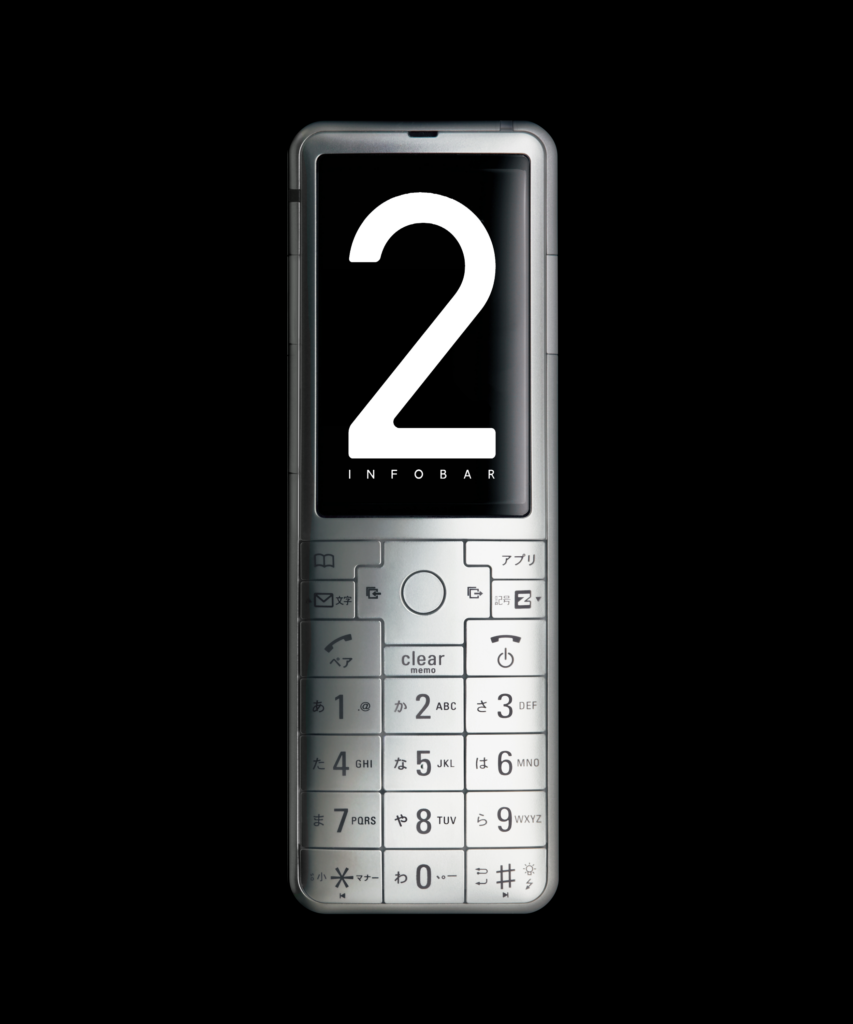
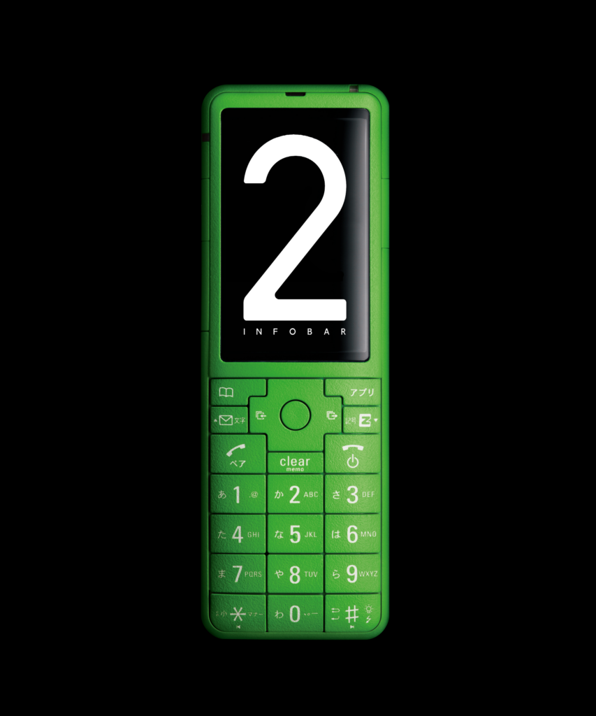
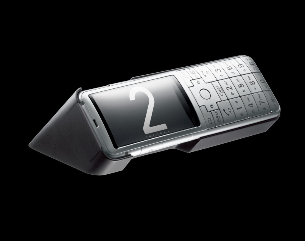
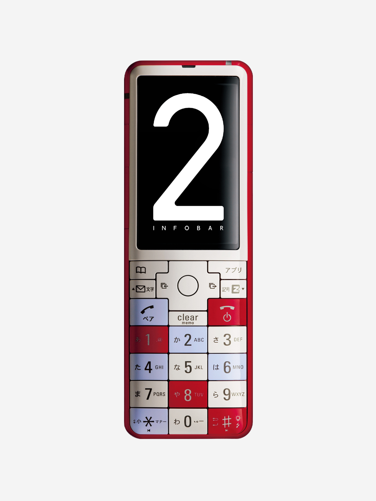
    身体が求めている丸くて優しい形。それをマスプロダクトとして現実化することは容易なことではありません。しかし、INFOBAR 2は、量産設計・製造を担当した鳥取三洋電機のエンジニア魂によって、2006 年に発表したコンセプトと寸分違わない再現性で量産化されたのでした。そのでき栄えはデザイン面でも技術面でもau Design project の集大成といえるものです。弧を描くディスプレイウィンドウはアクリル平板の曲げ加工で、背面側の曲面形状はバッテリーケースに角Rをつけることで実現しています。ワンセグアンテナは内蔵し、卓上ホルダ嵌合用の穴を本体から排除するため、卓上ホルダが筐体を抱え込む構造を考案するなど丸くて優しい形を損なわないためのあらゆる努力がなされています。MIDORI のみシボ加工が施され、CMF 面でも意欲的な製品でした。MEDIA SKIN 以前のモデルが、周波数再編による旧800MHz 帯停波で現在では使用できませんが、INFOBAR 2はau Design project 量産機の中で2017 年現在も使用できる唯一の端末です※。 ※執筆当時:現在は使用できません。

    The Culmination of au Design project

    A soft, rounded form that the human body instinctively responds to. Turning such a form into a mass-produced product, however, is no easy task. Yet thanks to the engineering expertise and dedication of Tottori Sanyo Electric, which was responsible for production engineering and manufacturing, INFOBAR 2 was mass-produced with a level of fidelity virtually identical to the concept model unveiled in 2006. In both design and engineering, the result can be regarded as the culmination of the au Design project.

    The gently curved display window was created by bending a flat acrylic sheet, while the curved surface on the back was achieved by rounding the corners of the battery cover. The One-Seg antenna was built into the body, and to eliminate the need for docking holes that would disrupt its smooth form, a desktop charging cradle was devised to wrap around and hold the handset itself. Every possible effort was made to preserve its soft, rounded shape.

    Only the MIDORI version featured a textured surface finish, making INFOBAR 2 an ambitious product in terms of CMF as well.

    Models released before MEDIA SKIN can no longer be used due to the shutdown of au’s former 800 MHz frequency band following spectrum reorganization. At the time of writing in 2017, however, INFOBAR 2 was the only mass-produced au Design project handset that could still be used.*
    *At the time of writing. INFOBAR 2 is no longer usable today.


    INFOBAR 2 グラフィックデザイン / INFOBAR 2 Graphic Design CD: Noriyuki Tanaka
    卓上ホルダ/Desktop Charging Cradle

    ACE 60キャリングケース/ ACE 60 Carrying Case CD: Kenmei Nagaoka
  • MEDIA SKIN

    MEDIA SKIN

    ANNOUNCEMENT DATE2007.03.20 (PASTEL BLUE 05.14)
    RELEASE DATE2007.03.23
    Brandau Design project
    TypeProduction Model
    DesignerTokujin Yoshioka
    ProducerSatoshi Sunahara
    ManufacturerKYOCERA
    Size ( W x H x D ) / Weight50 × 110 × 13.1(maximum thickness 13.7) mm / 104g
    MaterialsPlastic, tempered glass display, electronic components

    COLOR VARIATIONS

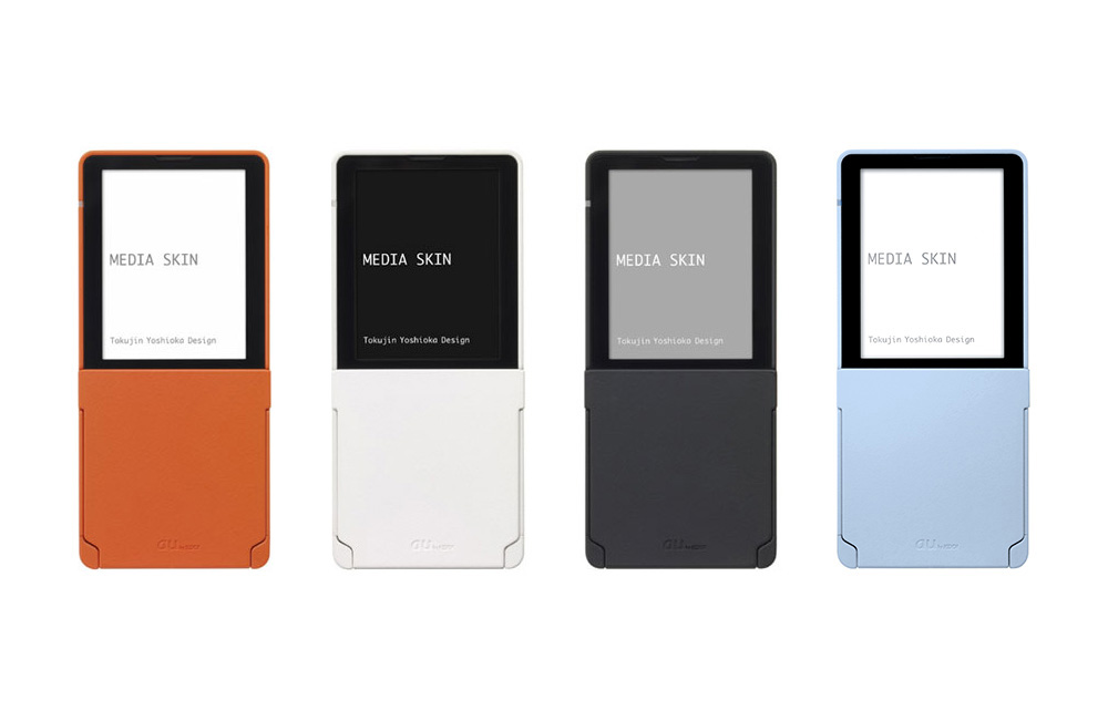
    ORANGE / WHITE / BLACK / PASTEL BLUE(3000台限定 / Limited Edition of 3,000)


    AWARDS


    MUSEUM COLLECTIONS


    ABOUT

    「第二の皮膚」の量産

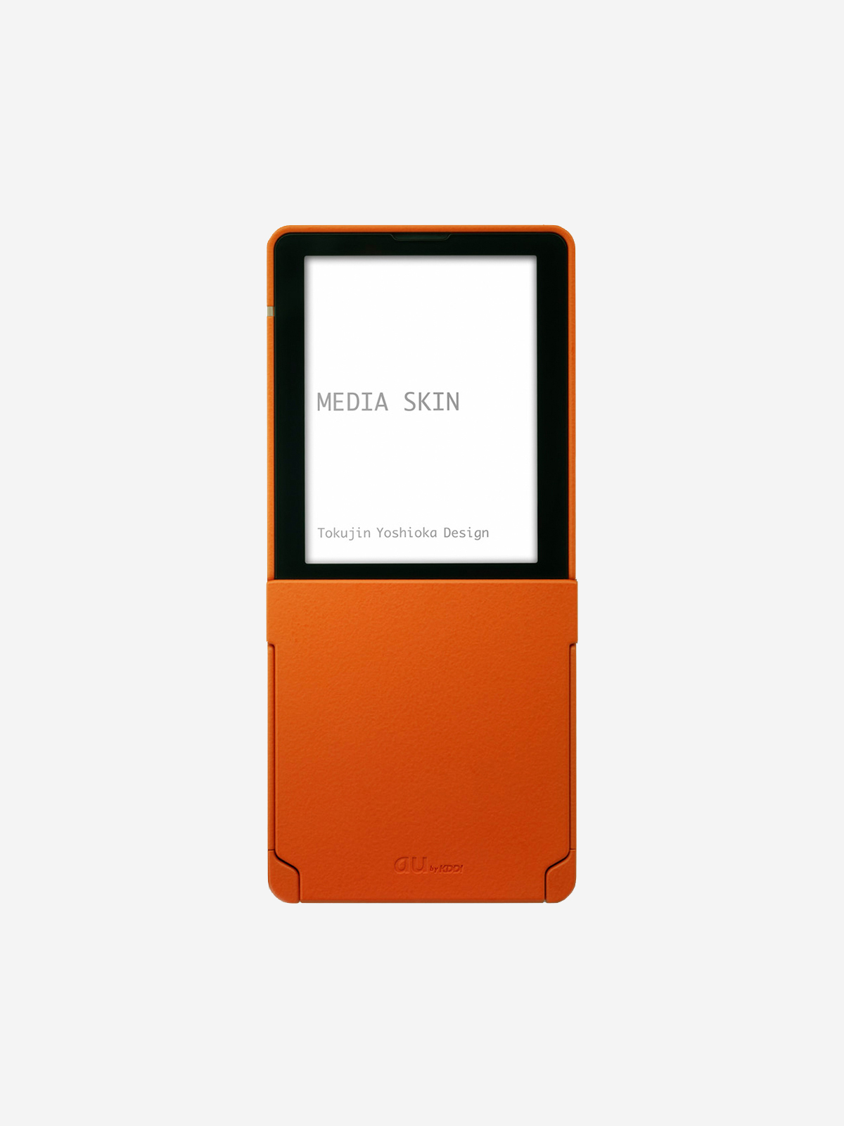
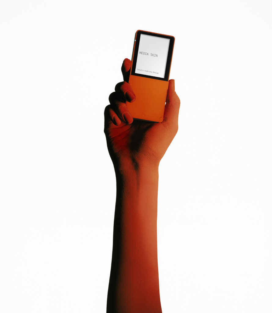
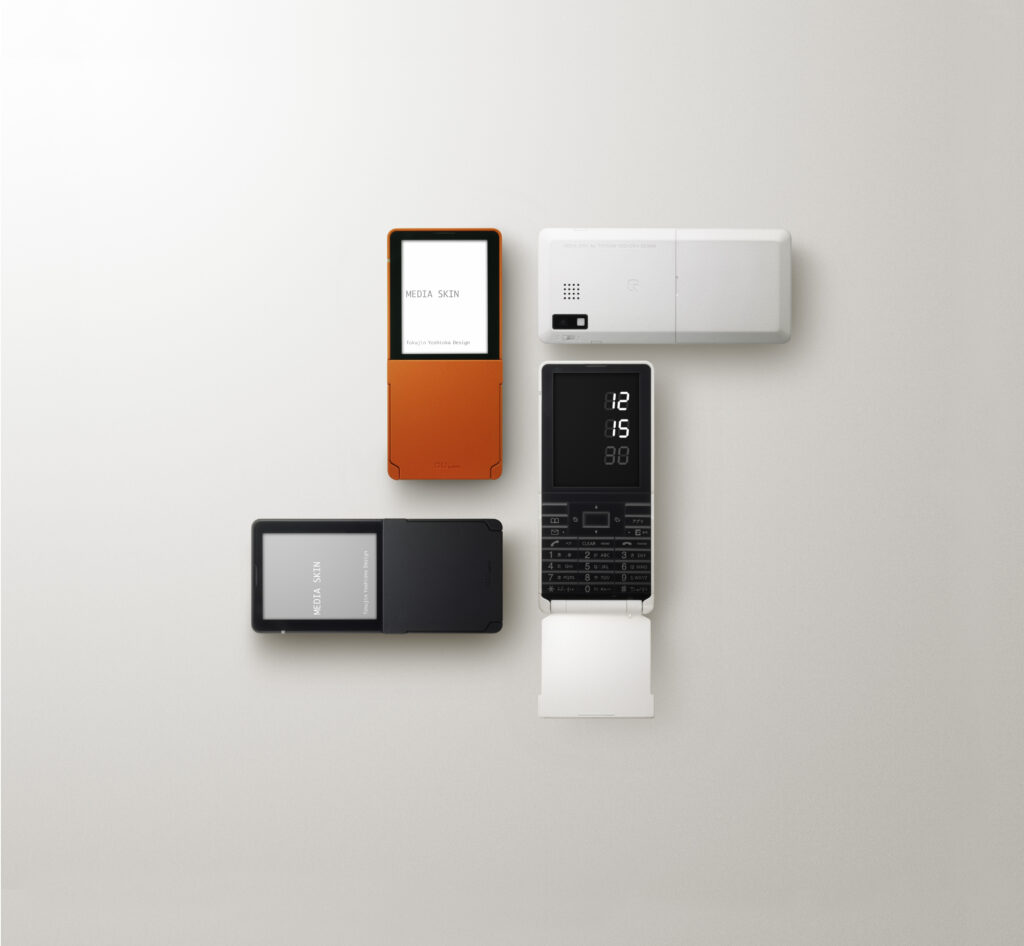
    「第二の皮膚」というコンセプトを裏切らない「触感」をいかに量産レベルで実現するか。従来から心地よい触感をもたらすソフトフィール塗料が存在していましたが、ウレタン粒子から作られるこの塗料は、経年劣化してベタベタしてしまう加水分解が課題でした。しかし、幸運なことにMEDIA SKIN の開発と時を同じくして、塗料メーカーから耐加水分解性を持った新しいソフトフィール塗料の提案が舞い込んできたのでした。これで「第二の皮膚」の実現性が見え、最終的にMEDIA SKIN のブラックはソフトフィール塗料とシボ加工を組み合わせ、他の色はシリコン粒子を配合した塗料を用いて、コンセプトに相応しい触感を実現しました。MEDIA SKINは世界初の有機EL ディスプレイを搭載し、ワンセグ・おサイフケータイ搭載機として当時最薄を記録するなど技術面でも注目を浴びました。MEDIA SKINが発表された2007 年1 月は、ニューヨーク近代美術館(MoMA)の永久収蔵品にINFOBAR、talby、neon、MEDIA SKINが選定され、初代iPhoneが米国で発表された時代の転換点でした。

    Mass-Producing the “Second Skin”

    How could we reproduce, at a mass-production level, a tactile quality that remained true to the concept of a “second skin”?

    Soft-touch coatings that provided a pleasant tactile feel already existed. However, these coatings, made with urethane particles, were prone to hydrolysis over time, causing their surfaces to become sticky. Fortunately, just as MEDIA SKINwas being developed, a paint manufacturer approached us with a new soft-touch coating that was resistant to hydrolysis.

    This breakthrough made the “second skin” concept technically feasible. For the black version of MEDIA SKIN, we ultimately combined a soft-touch coating with a finely textured surface finish, while the other colors used coatings containing silicone particles. Together, these treatments created a tactile experience worthy of the concept.

    MEDIA SKIN also attracted attention for its technological innovations. It featured the world’s first OLED display in a mobile phone and, at the time, was the thinnest handset to incorporate both One-Seg mobile TV and Osaifu-Keitai mobile payment functionality.

    January 2007, when MEDIA SKIN was unveiled, marked a turning point in the history of the mobile phone. INFOBAR, talby, neon, and MEDIA SKIN were selected for the permanent collection of the Museum of Modern Art (MoMA) in New York, while the original iPhone was unveiled in the United States that same month.


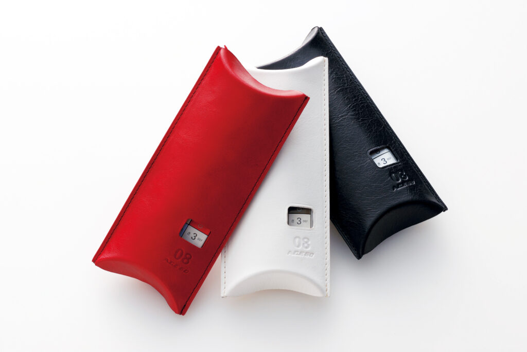
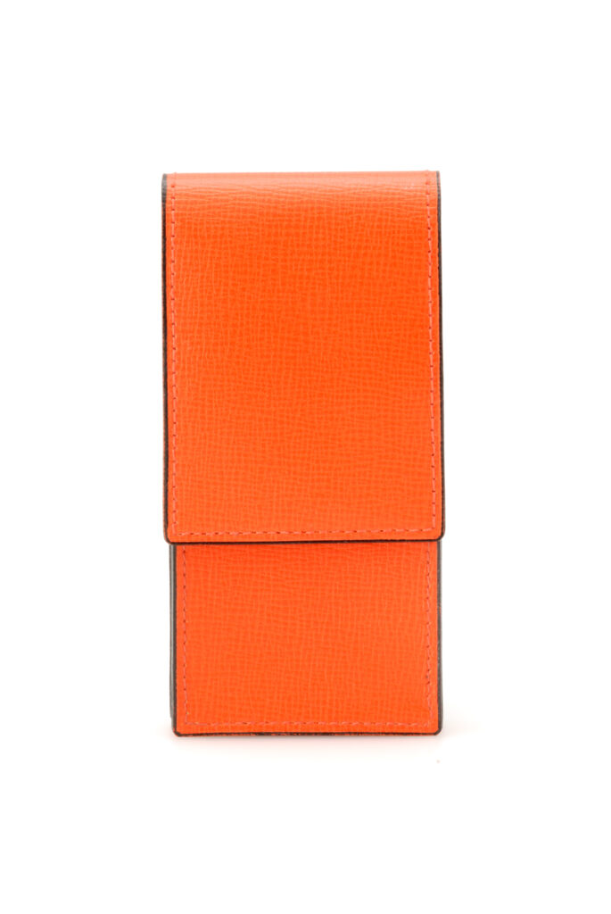
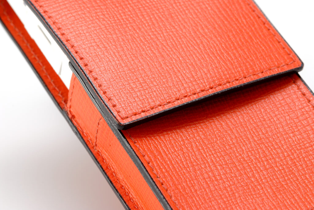
    Valextra 製MEDIA SKINキャリングケース / MEDIA SKIN Carrying Case by Valextra
  • neon

    neon

    ANNOUNCEMENT DATE2004.10.13
    RELEASE DATE2004.11.23
    Brandau Design project
    TypeProduction Model
    DesignerNaoto Fukasawa
    ProducerSatoshi Sunahara
    ManufacturerTOSHIBA
    Size ( W x H x D ) / Weight50 × 89 × 23 mm / 125g
    MaterialsPlastic, electronic components

    COLOR VARIATIONS

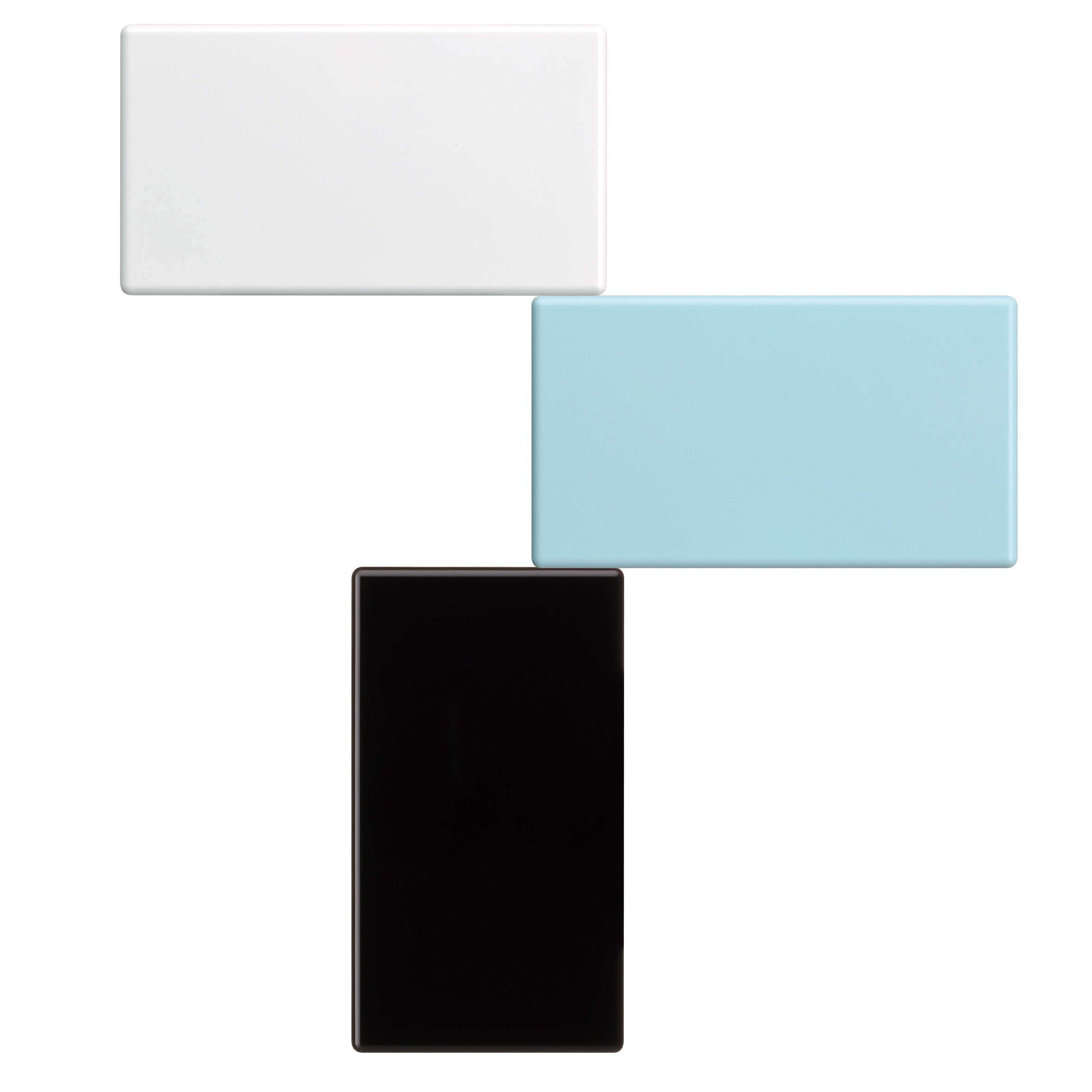
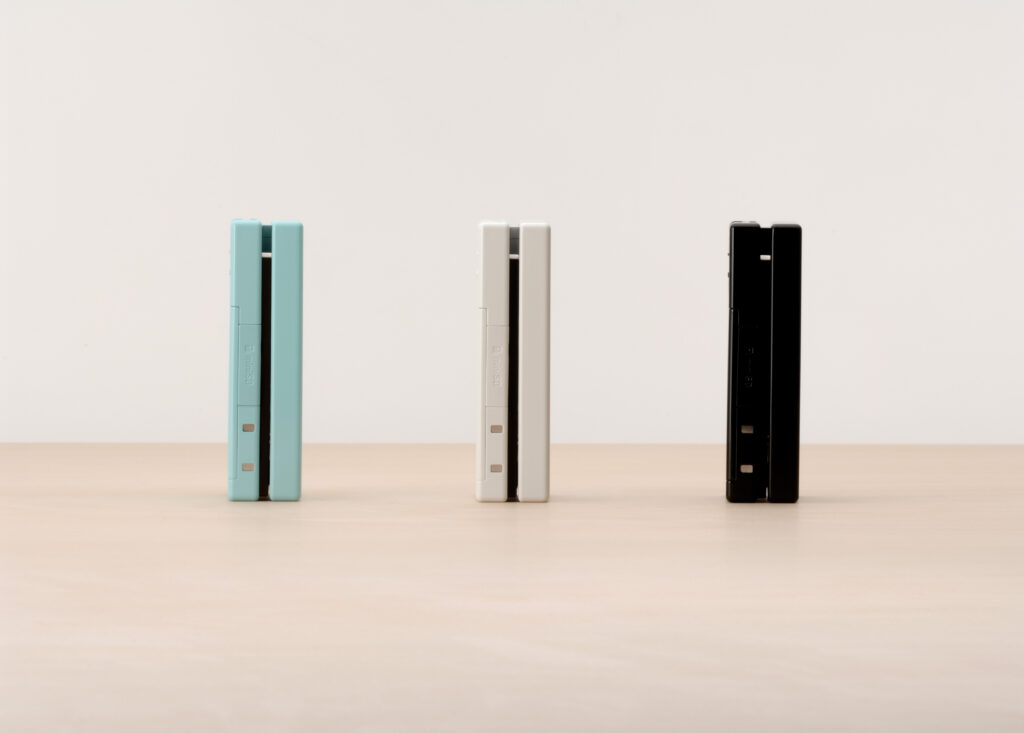
    shiro / mizuiro / kuro


    AWARDS

    • 2006年度グッドデザイン賞 / Good Design Award 2006

    MUSEUM COLLECTIONS


    ABOUT

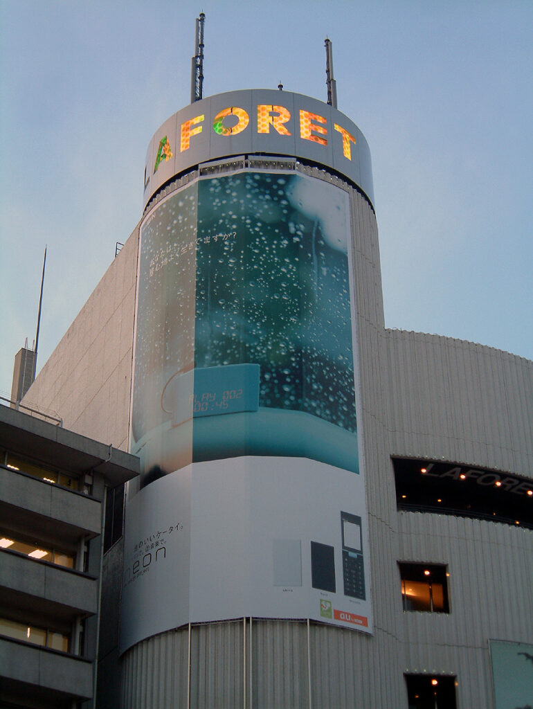
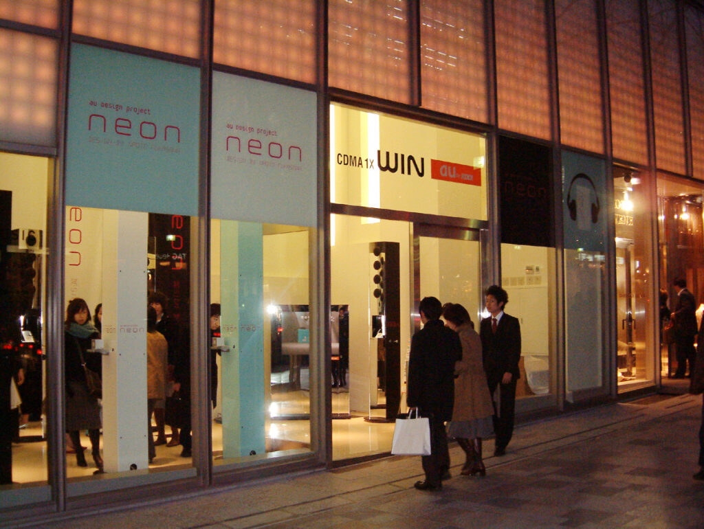
    マジカルなインターフェース

    2004 年のコンセプト「ITA」をベースに、au の音楽配信サービス「LISMO」開始に合わせて商品化されました。積み木のように美しい板が二枚重なっているだけに見える工業製品らしからぬシンプルなデザインは、スライド金型による成形と表から見えないヒンジを採用することで実現しています。そして何もないところから赤いLED 表示がくっきり浮かびあがるマジカルなインターフェース。8 文字表示の16セグメントLEDユニットが二つ搭載されていますが、非点灯時に全くその存在を感じさせない透過と隠蔽の絶妙なバランスを極めた筐体設計がなされています。音楽プレーヤー、FMラジオ、時刻などの表示に加え、開閉時にはユーモア溢れるLEDアニメ(142 種類)がランダムに表示されます。卓上ホルダに載せることでインテリアに溶け込む置き時計や音楽プレイヤーに変わります。携帯電話を携帯しない時間もデザインした携帯電話です。

    A Magical Interface

    Based on the 2004 concept model “ITA,” this phone was brought to market to coincide with the launch of au’s LISMO music distribution service.

    Its remarkably simple design—two beautifully proportioned slabs that appear to be stacked together like building blocks—looks unlike a conventional industrial product. This was made possible through the use of slide-mold construction and a hinge mechanism concealed from view.

    Then there is the magical interface: vivid red LED characters suddenly emerge from what appears to be a completely blank surface. The phone incorporates two 8-character, 16-segment LED units, while the body was meticulously engineered to achieve a delicate balance between transparency and concealment, leaving no visible trace of the displays when they are turned off.

    In addition to information such as the music player, FM radio, and time, one of 142 playful LED animations appears at random whenever the phone is opened or closed.

    Placed in its desktop charging cradle, the phone transforms into a clock or music player that blends naturally into the interior. It was a mobile phone designed not only for the time you carried it with you, but also for the time you didn’t.


  • PENCK

    PENCK

    ANNOUNCEMENT DATE2005.02.07
    RELEASE DATE2005.02.18
    Brandau Design project
    TypeProduction Model
    DesignerMakoto Saito
    ProducerSatoshi Sunahara
    ManufacturerHITACHI
    Size ( W x H x D ) / Weight57 × 98 × 28 mm / 134g
    Materialsplastic, electronic components

    COLOR VARIATIONS

    Metal / Milk / Bitter


    AWARDS

    • 2005 年度グッドデザイン賞 / Good Design Award 2005
    • Chicago Athenaeum Good Design 2005(米 シカゴ建築・デザイン博物館)

    MUSEUM COLLECTIONS


    ABOUT

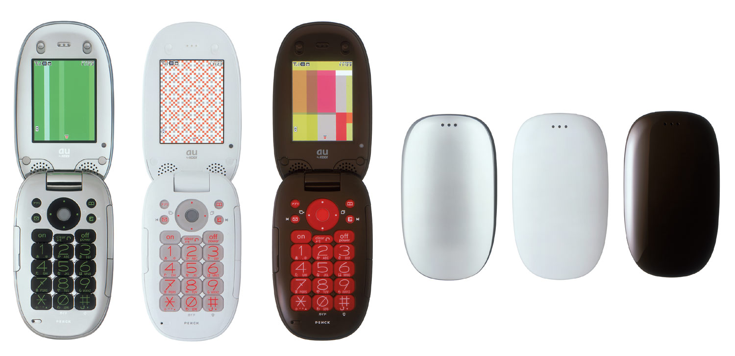
    金属と電波

    メタルボディの実現は当時のデザイナーそしてエンジニアの憧れでした。金属素材の採用はコストや加工技術上の課題はさることながら、そもそも携帯電話全体を金属で覆ってしまうと電波が遮断されてしまい、携帯電話としての用をなさなくなってしまうことが最大の問題でした。蒸着技術を用いて、樹脂に金属感を与える方法も、結局は金属の薄膜が電波を遮ってしまうため筐体全面に用いることはできませんでした。ところが、電波を通すことのできる「不連続蒸着」という画期的な蒸着技術が現れました。不連続蒸着は金属の並びが連続していないため、その隙間から電波を通過させることができる技術です。PENCK(ペンク)は携帯電話として初めて不連続蒸着を採用し、金属の塊のような筐体を実現しました。au Design projectは加飾技術、塗料・塗装技術など最先端のCMFに果敢に挑戦するプロジェクトでもありました。

    Metal and Radio Waves

    Achieving a metal body was something both designers and engineers aspired to at the time. Beyond the challenges of cost and manufacturing, however, there was a more fundamental problem: covering an entire mobile phone in metal would block radio waves, preventing it from functioning as a phone.

    Vapor deposition offered a way to give resin a metallic appearance, but even the thin layer of metal created by this process blocked radio waves, making it impossible to apply across the entire body.

    Then came a breakthrough technology known as “discontinuous vapor deposition,” which allowed radio waves to pass through. Because the deposited metal particles do not form a continuous layer, radio waves can travel through the gaps between them.

    PENCK was the first mobile phone to adopt discontinuous vapor deposition, making it possible to create a body that appeared almost like a solid mass of metal.

    The au Design project was also a project that boldly explored the cutting edge of CMF, taking on new challenges in decorative finishing, paints, coating technologies, and other advanced surface treatments.

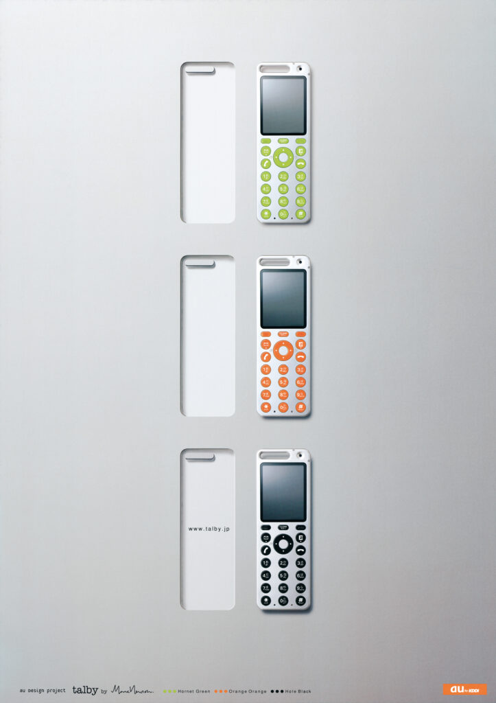
  • talby

    talby

    ANNOUNCEMENT DATE2004.10.13
    RELEASE DATE2004.11.23
    Brandau Design project
    TypeProduction Model
    DesignerProduct: Marc Newson
    Sound: Nick Wood
    UI: Brendon Smale
    ProducerSatoshi Sunahara
    ManufacturerSANYO Multimedia Tottori
    Size ( W x H x D ) / Weight45 × 132 × 13 mm / 79g
    MaterialsPlastic, electronic components

    COLOR VARIATIONS

    Hornet Green / Orange Orange / Hole Black


    AWARDS

    • 2004年度グッドデザイン賞 / Good Design Award 2004
    • Chicago Athenaeum Good Design 2005 (米 シカゴ建築・デザイン博物館)

    MUSEUM COLLECTIONS


    ABOUT

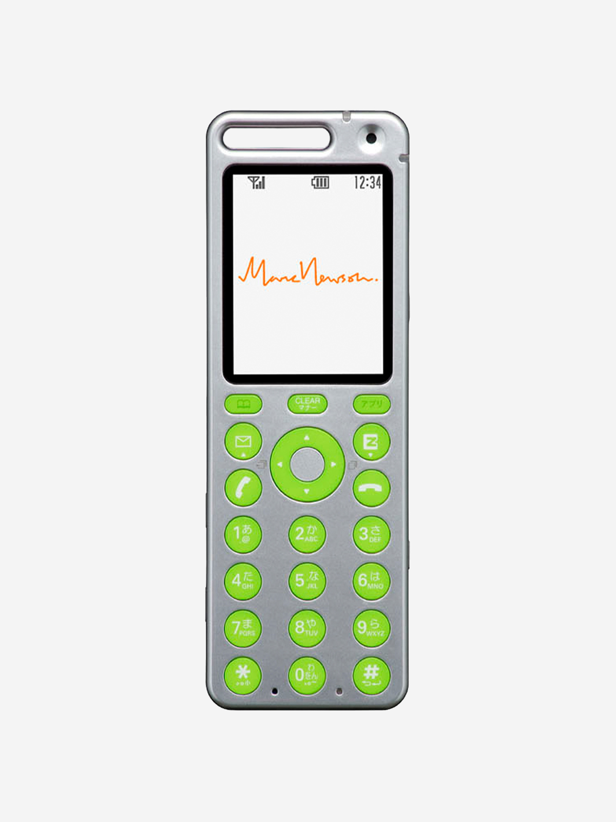
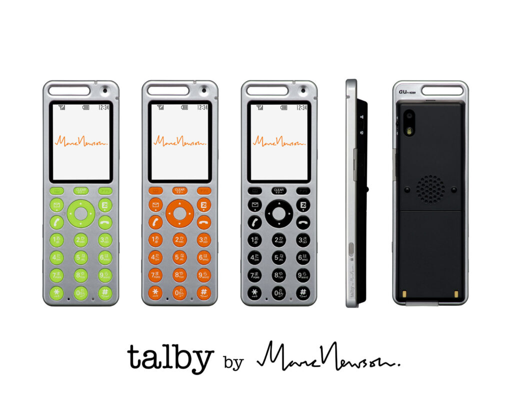
    アルミユニボディ

    一枚のアルミニウム板を削り出して作られたtalbyコンセプトのユニボディ。当時、切削加工は試作品では用いられても、時間そしてコスト的制約から量産品で採用するのは現実的ではありませんでした。talby 量産化にあたり、talbyコンセプトの美しいユニボディをいかに実現するかが最大の課題でした。アルミプレス加工での再現がまず検討されましたが、側面に継ぎ目が出てしまうことから見送られました。最終的にアルミであることよりもユニボディであることを優先し、樹脂でユニボディ的なフォルムを実現することにしました。量産製品に切削加工を用いる革命を起こしたのはAppleでした。MacBook Air(2008 年)は、アルミ切削加工のユニボディを実現した最初の製品です。当時は、そんな夢のような時代がやってくるとは思いも寄りませんでした。ただ、talbyを片手に「次はAppleと携帯電話のプロジェクトやりたいね」と無邪気に語り、まだ見ぬその姿に思いを馳せていたのでした。

    Aluminum Unibody

    The talby concept featured a unibody machined from a single piece of aluminum. At the time, machining was commonly used for prototypes, but the time and cost involved made it impractical for mass-produced products. The greatest challenge in bringing talby to production was how to reproduce the concept model’s beautiful unibody construction.

    Aluminum press forming was initially considered, but the idea was abandoned because it would have left visible seams along the sides. Ultimately, we decided that preserving the unibody form was more important than using aluminum, and instead created a unibody-like form in resin.

    It was Apple that later revolutionized mass production by introducing machining on an industrial scale. The MacBook Air (2008) was the first Apple product to feature a unibody enclosure machined from aluminum. At the time, we could hardly have imagined that such a seemingly dreamlike future would soon become reality.

    Still, with talby in hand, we would innocently say to each other, “Next time, it would be great to do a mobile phone project with Apple,” and imagine what such a phone—one that did not yet exist—might look like.


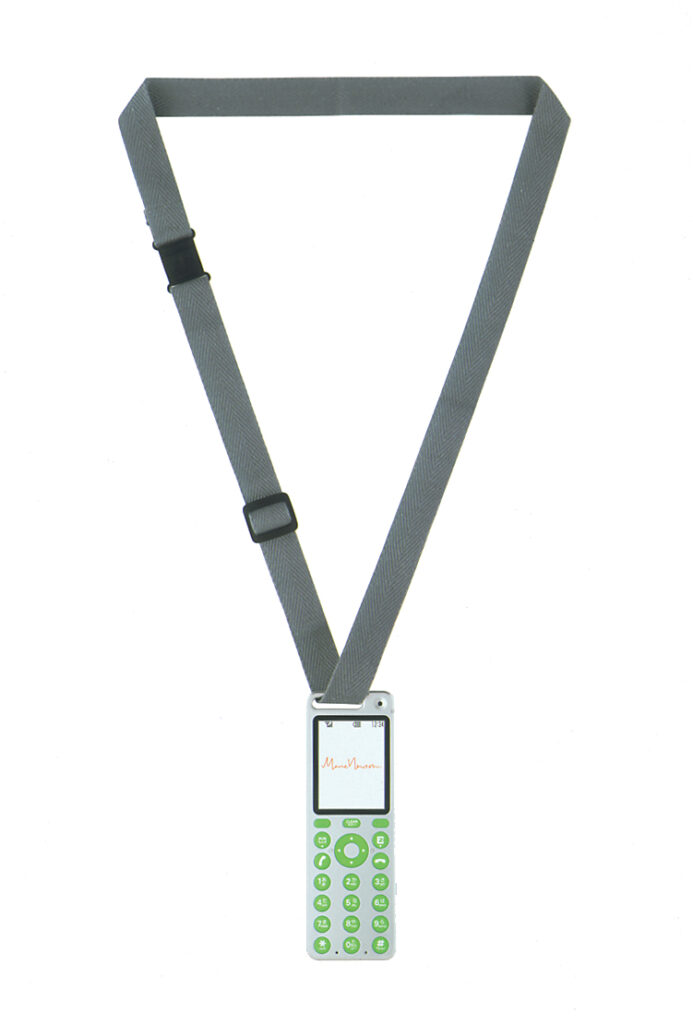
    コットン製ストラップ / Cotton Strap
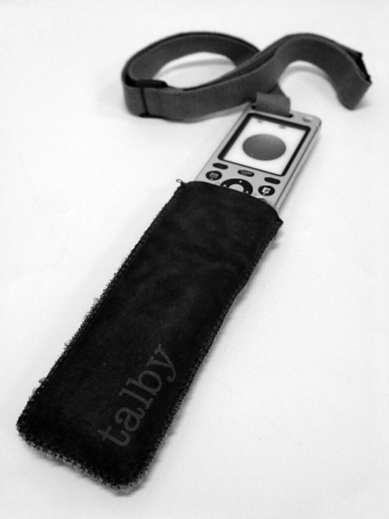
    BEAMSとのコラボレーションにより150 個限定で発売されたMarc Newsonデザインのムートン製ケース / A Marc Newson-designed sheepskin case, released in a limited edition of 150 through a collaboration with BEAMS CD: Yoshikage Kagiwara
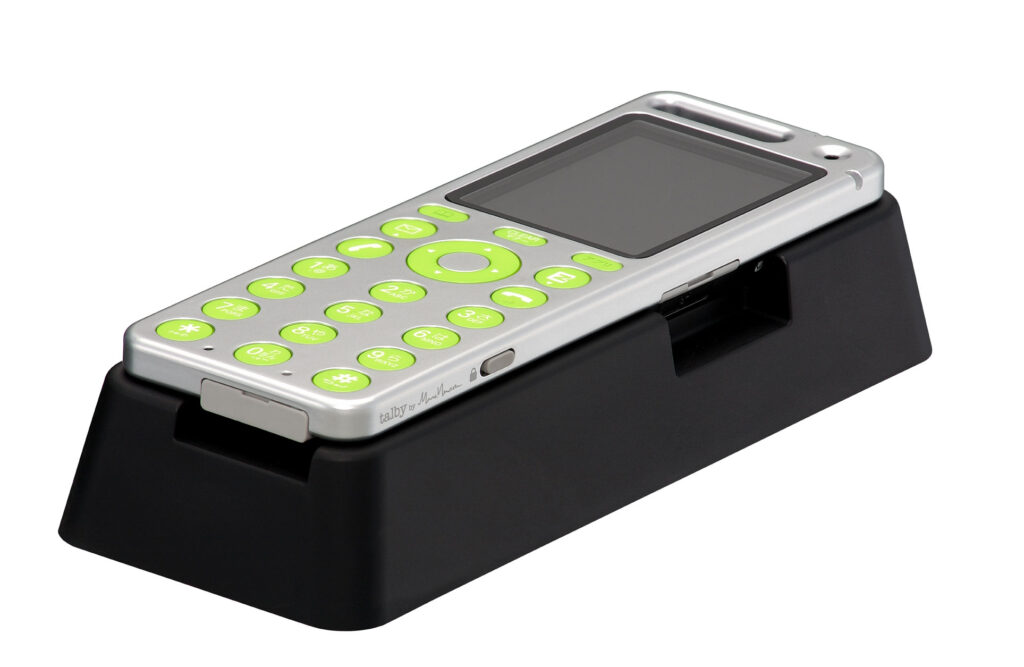
    卓上ホルダ / Desktop Charging Cradle
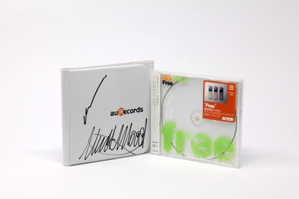
    Marc Newsonの友人である音楽プロデューサー・Nick Woodが手がけたtalby CM 曲「Free」のCDとMarc Newson、Nick Woodのサイン入りCDケース / The CD single of “Free,” the talby commercial song produced by Marc Newson’s friend, music producer Nick Wood, together with its CD case signed by Marc Newson and Nick Wood
    talby ポスター / talby poster CD: Yukio Oshima

    あなたのことは今でも好きです。

    でも私たちはきっと

    1000回もメールをやりとりして、

    たぶん心は1センチくらいしか

    近づけませんでした。


    I still love you.

    We must have exchanged

    1000 e-mails.

    But our hearts only got closer

    by 1 centimeter.


    新海誠監督『秒速5センチメートル』とtalby

    新海誠監督のアニメーション映画『秒速5センチメートル』(2007年)。第三話には、遠野貴樹と交際していた水野理紗の携帯電話として、au Design projectの「talby」が登場します。

    画面に刻まれた日付と時刻、メール、手に取られるtalby。短いカットの積み重ねが、二人の間を流れた時間と、近づけなかった心の距離を静かに伝えます。

    人と人をつなぐために生まれたケータイは、ときに、二人のあいだにある距離を映し出すものでもありました。いつでも、どこでも、誰かとつながれるようになった今、私たちの距離は近くなったのでしょうか。


    5 Centimeters Per Second and talby

    In Makoto Shinkai’s animated film 5 Centimeters Per Second (2007), an au Design project talby appears in the third chapter as the mobile phone used by Risa Mizuno, who was in a relationship with Takaki Tono.

    Dates and times on the screen, emails, and a talby in hand. These brief shots quietly convey the time that passed between them̶and the emotional distance they could not close.

    Mobile phones were created to connect people, yet sometimes they also revealed the distance between them. Now that we can connect with anyone, anytime, anywhere, have we really grown any closer?

    © Makoto Shinkai / CoMix Wave Films

  • W11K

    W11K

    ANNOUNCEMENT DATE2003.10.22
    RELEASE DATE2003.12.20 (KURO) / 2003.12.23 (AKA, SHIRO)
    Brandau Design project
    TypeProduction Model
    DesignerNaoto Fukasawa
    ProducerSatoshi Sunahara
    ManufacturerKYOCERA
    Size ( W x H x D ) / Weight50 × 100 × 30 mm (miniSDジャケット装着時厚さ34mm)/ 128g(ジャケット装着時136g)
    MaterialsPlastic, electronic components

    COLOR VARIATIONS

    AKA / KURO / SHIRO


    MUSEUM COLLECTIONS


    ABOUT


    丸と多面体

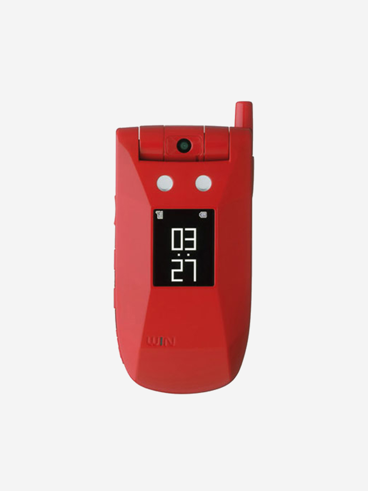
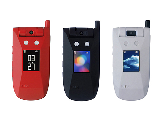
    au の高速データ通信サービス「CDMA 1X WIN」開始に伴い開発された携帯電話です。当初、WIN 対応機として投入が予定されていたのは「W11H」1 機種のみでした。しかし、新サービス開始に相応しい端末バリエーションを用意すべく、W11Hをベースにした兄弟機を開発する計画が持ち上がりました。丸いフォルムのW11Hに対してどれだけ異なる印象を持った製品に仕立てることができるか。この問いに対し出された解は「丸いかたちを多面にそぎ落としたかたち」(深澤直人)。私たちの前に現れたのは、W11Hの丸いフォルムと見事な対照をなす多面体フォルムでした。W11Kは、ユーザーから「ガンダムケータイ」と呼ばれ親しまれましたが、深澤さんの頭の中にあったのは、包丁で皮を削いで多面になった「じゃがいも」。じゃがいもを水洗いしている時の、鈍角のエッジが手のひらにあたる心地いい感触をモチーフに生まれた形です。

    Rounded and Faceted

    The W11K was developed for the launch of au’s high-speed data communication service, “CDMA 1X WIN.” Initially, only one WIN-compatible model, the W11H, was scheduled for release. However, in order to offer a broader range of handsets worthy of the launch of a new service, a plan emerged to develop a sister model based on the W11H.

    The challenge was how to create a product with a distinctly different character from the W11H and its rounded form. Naoto Fukasawa’s answer was “a shape created by shaving a rounded form down into multiple facets.” The result was a striking faceted form that stood in sharp contrast to the soft, rounded form of the W11H.

    The W11K became affectionately known among users as the “Gundam phone.” But what Fukasawa actually had in mind was a potato—its skin pared away with a kitchen knife, leaving behind a faceted form. The design was inspired by the pleasant tactile sensation of the potato’s gently angled edges pressing against the palm as it is washed in water.

  • INFOBAR

    INFOBAR

    ANNOUNCEMENT DATE2003.10.06
    RELEASE DATE2003.10.31
    Brandau Design project
    TypeProduction Model
    DesignerNaoto Fukasawa
    ProducerSatoshi Sunahara
    ManufacturerSANYO Multimedia Tottori
    Size ( W x H x D ) / Weight42 × 138 × 11 mm / 87g
    MaterialsMagnesium alloy, plastic, electronic components

    Details
    Outer Frame: Magnesium alloy
    Rear Body (Camera Side): PC/ABS
    Display Panel / Camera Panel / Tile Keys: PMMA
    Antenna Top / Mail / Memo / EZ Button: ABS
    Center Key / Camera Key / App Key / Battery Pack: PC
    Earphone Cover / Terminal Cover: Elastomer
    Lock Button / Battery Pack Lock: Polyacetal (POM)

    COLOR VARIATIONS

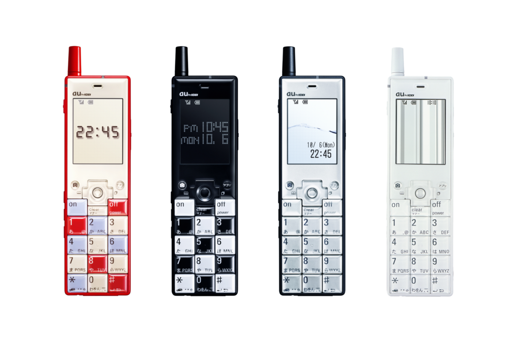
    NISHIKIGOI / ICHIMATSU / BUILDING / ANNIN


    AWARDS

    • 2003年度グッドデザイン賞 / Good Design Award 2003
    • 2004年度アジアデザイン賞 大賞 (中・香港)/ DFA Design for Asia Awards Grand Award
    • iF DESIGN AWARD 2005 (独・ハノーバー iFデザイン賞)
    • 小学館『DIME』「2003小学館 DIMEトレンド大賞」ビジネス・IT部門金賞
    • ソニーマガジンズ『デジモノステーション』「デジモノ オブ ザ イヤー 2003」通信・モバイル部門賞、審査員特別賞
    • マガジンハウス『POPEYE』「’03 デジタル・デザイン・オブ・ザ・イヤー」金賞
    • インプレス『ケータイWatch』「読者が選ぶ ケータイ of the Year 2003」1位
    • モノ・マガジン「スーパーグッズ・オブ・ザ・イヤー」審査員特別賞、デザイン賞

    MUSEUM COLLECTIONS


    ABOUT

    デザインケータイの原型

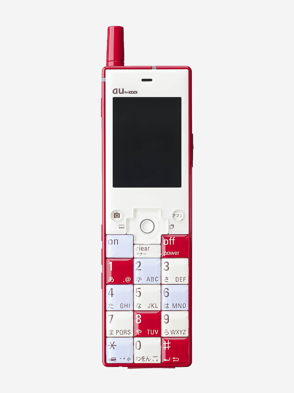
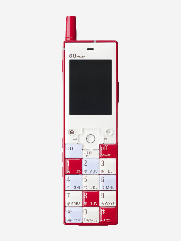
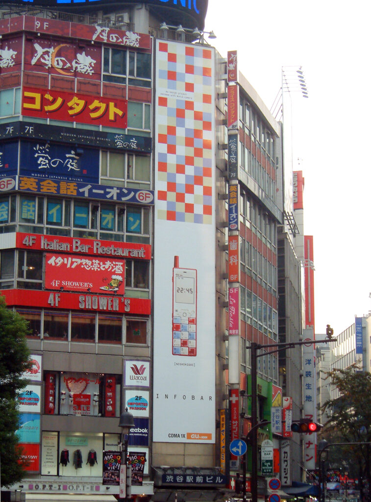
    2001 年5月に発表したコンセプトモデルinfo.barは、携帯電話のメインストリームが捉えていなかった「デザインのいい携帯電話が欲しい」という漠然とした潜在ニーズを概念化し具体化しました。そして、発表するや否や「これが欲しかった!」と多くの人から共感を得たのでした。しかし、コンセプトとして発表することと、それを製品化することの間には実に大きな溝があります。初の自社企画製品だったこともあり、開発着手に漕ぎつけるまでには紆余曲折、1年半の歳月を要しました。さらに開発に1 年、さまざまな技術的課題を乗り越えて、2003 年10月、au Design project 第1 弾としてINFOBARは鮮烈なデビューを果たしました。折りたたみ式の携帯電話が全盛期を迎えつつあった時代、ストレート式のボディに「NISHIKIGOI」や「ICHIMATSU」など斬新なカラーを纏ったINFOBARのインパクトは、auブランドにも影響を与え、auはデザイン力の高いブランドとして認知されるようになったのでした。INFOBARは「デザインケータイ」のパイオニアとして今なお愛され続けています。

    The Prototype for the Design Phone

    The concept model info.bar, unveiled in May 2001, gave form to a vague but latent desire that the mainstream mobile phone market had yet to recognize: “I want a well-designed mobile phone.” The moment it was unveiled, it resonated with many people, who responded, “This is what I’ve been waiting for!”

    However, there is a considerable gap between presenting a concept and turning it into an actual product. As this was also our first independently conceived product, the road to development was far from straightforward, and it took a year and a half before the project could officially get underway. Another year of development followed, during which we overcame a wide range of technical challenges.

    Finally, in October 2003, INFOBAR made its striking debut as the first product of au Design project.

    At a time when folding mobile phones were becoming dominant, INFOBAR made a powerful impression with its straight body and bold color schemes such as NISHIKIGOI and ICHIMATSU. Its impact extended beyond the product itself to the au brand, helping establish au as a brand with a strong reputation for design.

    As a pioneer of the “design phone,” INFOBAR continues to be loved to this day.


    INFOBAR発売初日(2003年10月31日)渋谷スクランブル交差点にて / On the first day of INFOBAR sales (October 31, 2003) At Shibuya Scramble Crossing Photo: Satoshi Sunahara
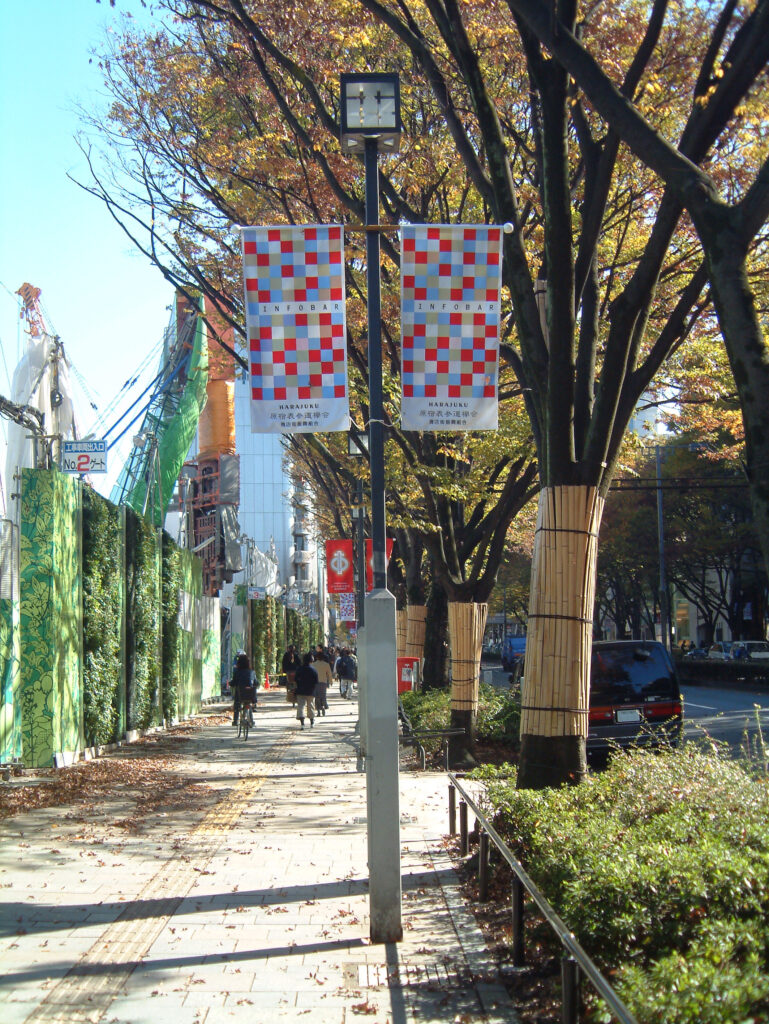
    2003年11月、表参道にて(左は建設中の表参道ヒルズ)/ Omotesando, November 2003 (Omotesando Hills under construction on the left) Photo: Satoshi Sunahara